The best newspapers in Europe this year come from Norway, the Netherlands, Portugal, Great Britain and Germany. A total of 184 newspapers from 25 countries took part in the 21st European Newspaper Award. There were more than 4,000 entries in the 20 categories of the competition. In addition, 286 online projects from 11 countries were submitted to the jury. Compared to the previous year, significantly more multimedia and data journalistic projects were submitted.
Here we show the work of the main prize winners of the 21st European Newspaper Award. In most cases these are both print and online projects. The online projects are provided with links.
Some time has passed since the publication of the results in December 2019. Therefore, we have added recent work on the topic of the Corona crisis to some of the prize winners. This shows that visual journalism is an essential part of modern newspaper design and is used in day-to-day life.
The yearbook of the 21st European Newspaper Award contains all winning pages in the 20 categories. The book has more than 1,400 images and is supplied as a USB stick. To order please click HERE.
The main prizewinners will present their work at the Congress, which this year will be held for the first time at Schönbrunn Palace in Vienna. The planned date is 4 to 6 October 2020. For the programme and registration please click HERE.
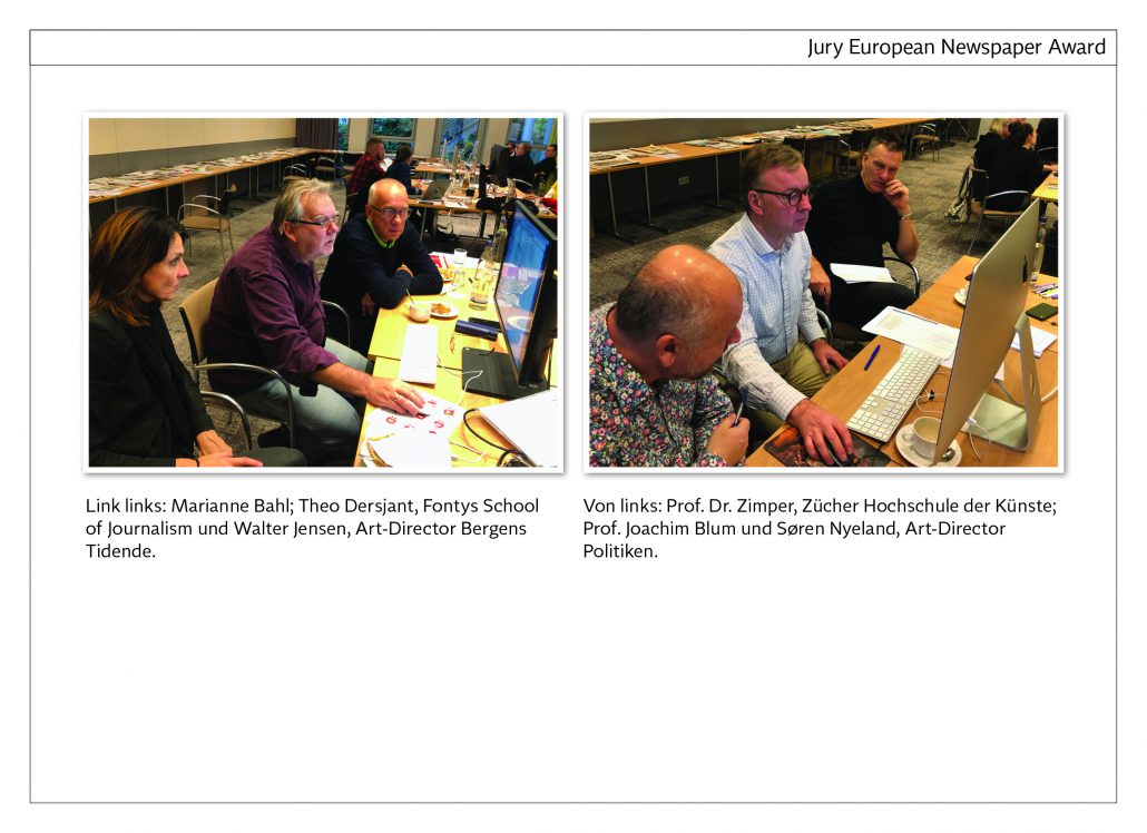
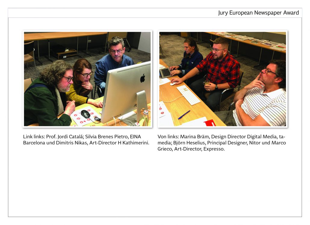
The Jury of the 21st European Newspaper Award
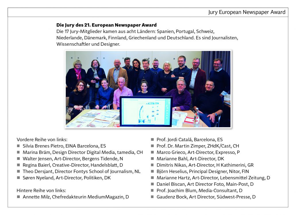 The jury of the 21st European Newspaper Award
The 17 jury members came from eight countries: Spain, Portugal, Switzerland, Netherlands, Denmark, Finland, Greece and Germany. They are journalists, Scientists and designers.
Press Release
Results of the 21st European Newspaper Award
The best newspapers in Europe this year come from Norway, the Netherlands, Portugal, Great Britain and Germany. A total of 184 newspapers from 25 countries took part in the 21st European Newspaper Award. There were more than 4,000 entries in the 20 categories of the competition.
In addition, 286 online projects from 11 countries were submitted to the jury. Compared to the previous year, significantly more multimedia and data journalistic projects were submitted.
The jury of the 21st European Newspaper Award
The 17 jury members came from eight countries: Spain, Portugal, Switzerland, the Netherlands, Denmark, Finland, Greece and Germany. They are journalists, scientists and designers.
The main prize winners „European Newspaper of the Year
The main prize „European Newspaper of the Year“ is divided into four categories in order to take into account the different technical and financial possibilities of newspapers: Local newspaper, regional newspaper, national newspaper and weekly newspaper. This year there will also be a special award, a „Judges‘ Special Recognition“:
Local newspaper: Fædrelandvennen, Norway
Regional newspaper: Leeuwarder Courant, Netherlands
Nationwide newspaper: Público, Portugal
Weekly newspaper: Financial Times – FT Weekend, Great Britain
Judges‘ Special Recognition: Fuldaer Zeitung, Germany
Europe’s biggest newspaper competition
The European Newspaper Award is organized by newspaper designer Norbert Küpper. It is considered the largest newspaper competition in Europe and is now taking place for the 21st time. The aim is to show international trends in newspapers in print and online and to promote the exchange of creative ideas in Europe.
Award ceremony and congress in Vienna
The award ceremony will take place during a congress in Vienna. The European Newspaper Congress was renamed the European Publishing Congress in order to meet the changing needs of publishing houses. The congress will be held for the first time at Schönbrunn Palace from 26 to 28 April 2020. In recent years, around 500 journalists and publishing managers from more than 30 countries have taken part in this event.
Contact
Norbert Küpper
Gutenbergstr. 4
40670 Meerbusch
Germany
Phone +49 2159 911615
Email nkuepper@newspaperaward.org
www.newspaperaward.org
Judges’ Special Recognition: Fuldaer Zeitung, D
Jugdes‘ Special Recognition: Fuldaer Zeitung, D
Jury statement
Innovation is the keyword with Fuldaer Zeitung. They want to strengthen the printed newspaper and rely on a strong visual presentation of the contents. Interesting journalistic topics should not only be well written but also adequately presented visually.
Every day a single theme is chosen and shown on the front page by a dominant photo. On the following pages this topic of the day is presented in a combination of texts, photos and infographics. It can be a local, regional or nationwide theme. Fuldaer Zeitung consequently deviates from the structure of comparable newspapers and creates a magazine atmosphere that is unusual for regional newspapers. Undoubtedly a role model for newspapers in Europe.
About the newspaper
Fuldaer Zeitung appears in Berlin format and has a circulation of approx. 37,000 copies.
Update:
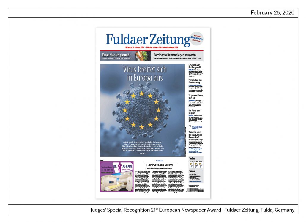
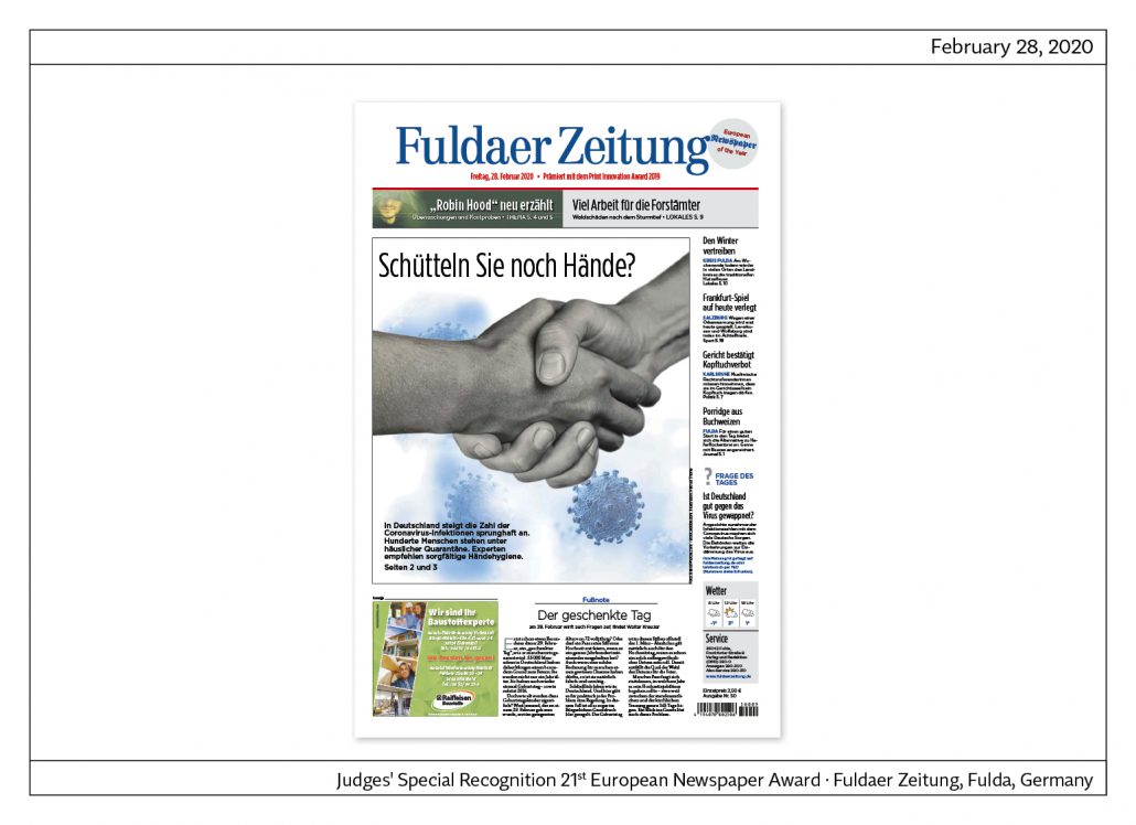
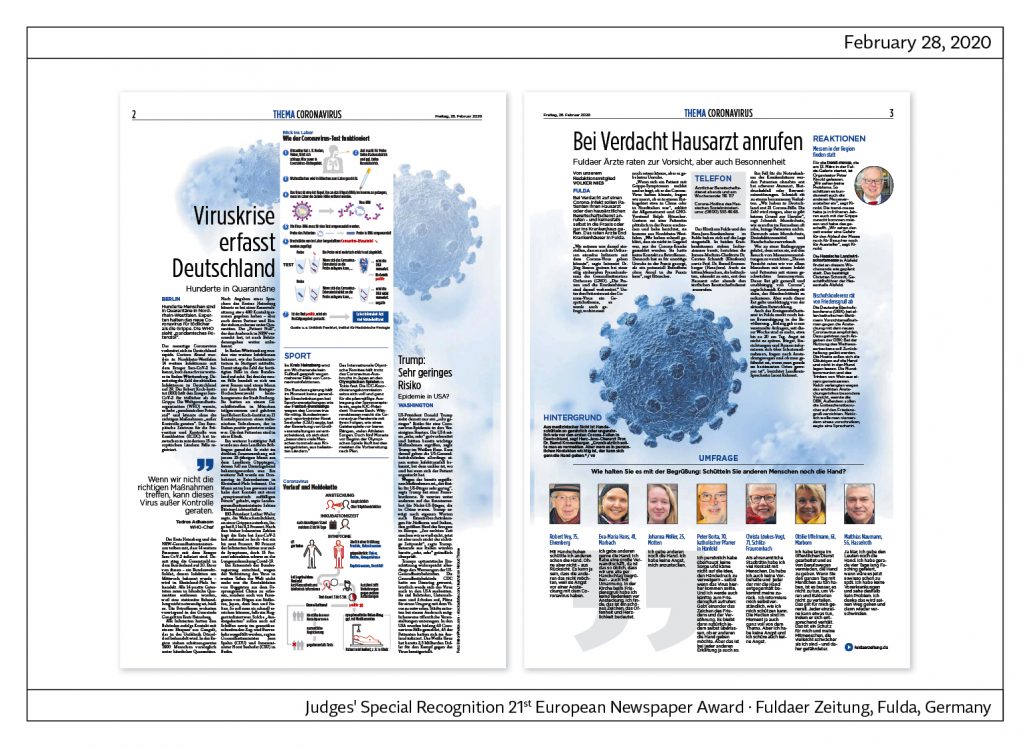
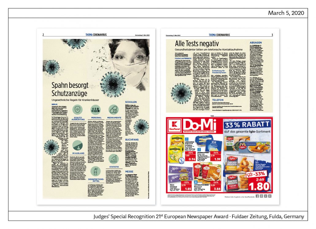
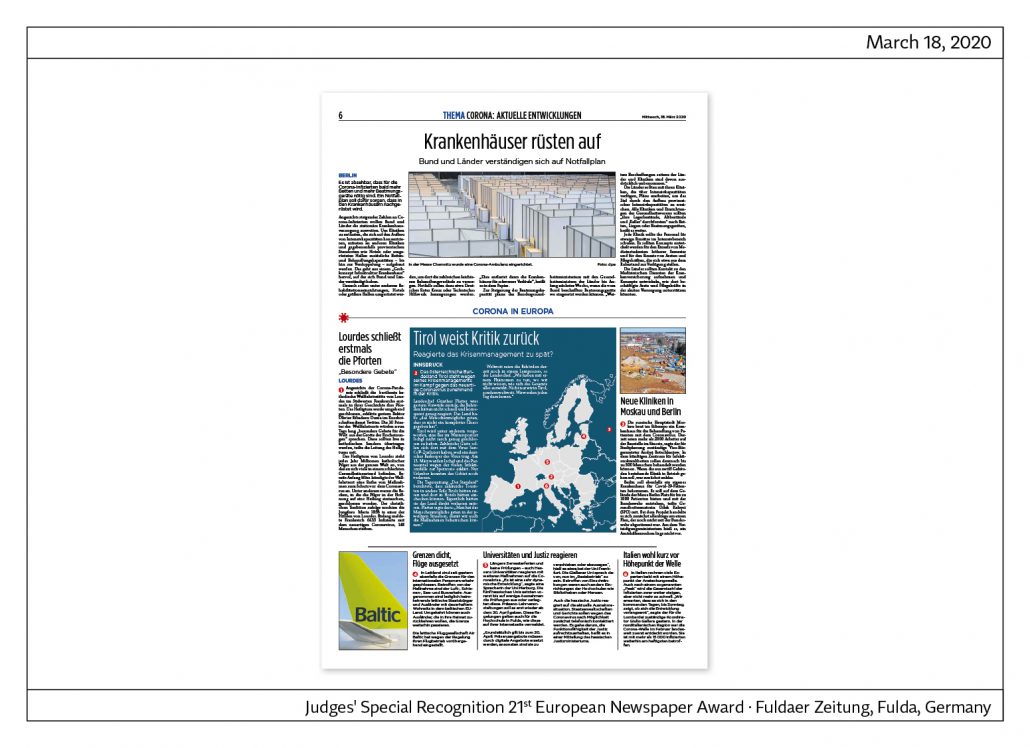
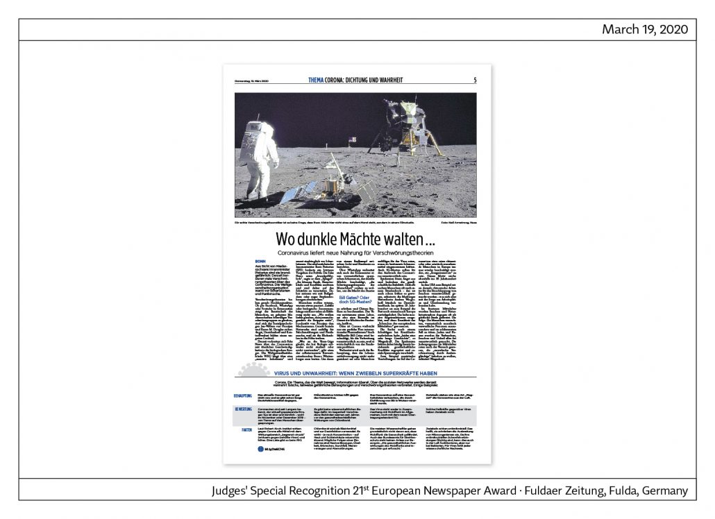
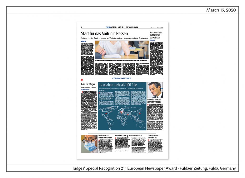
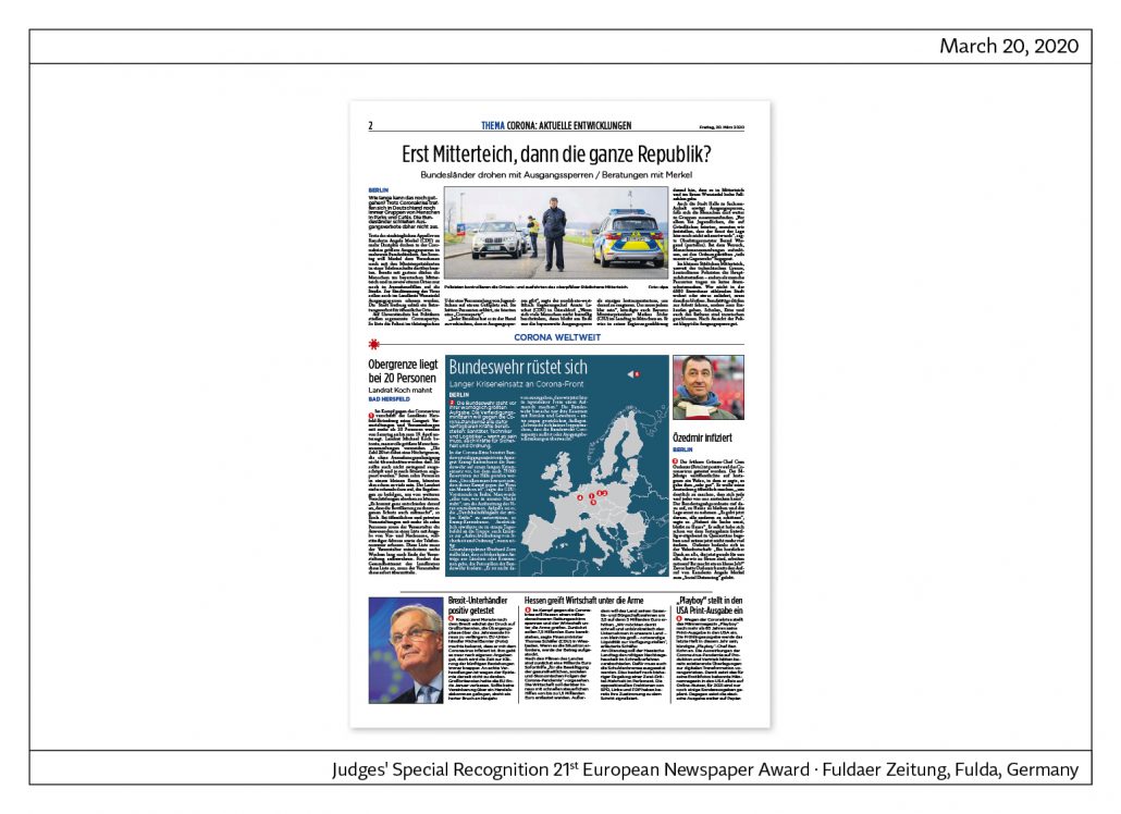
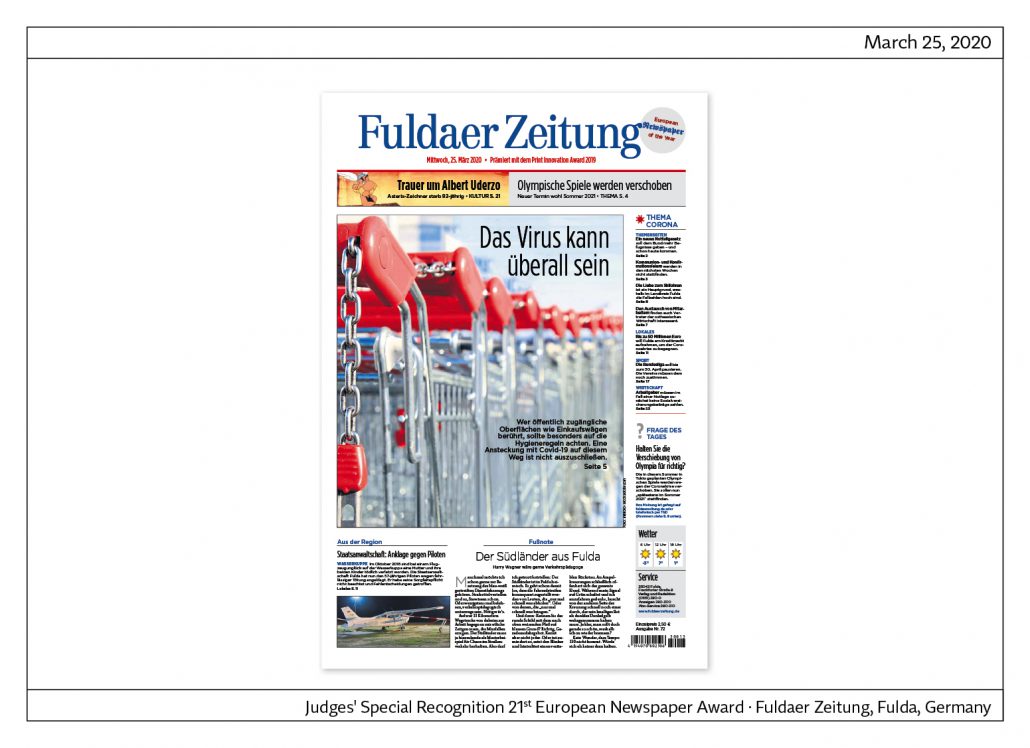
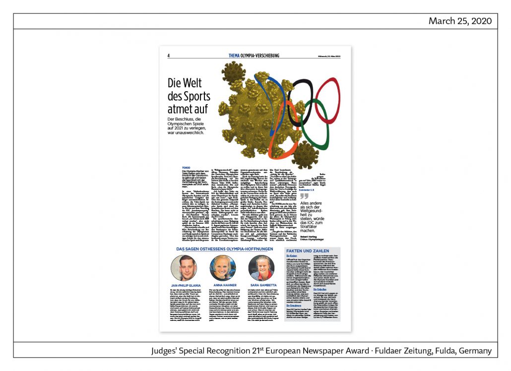
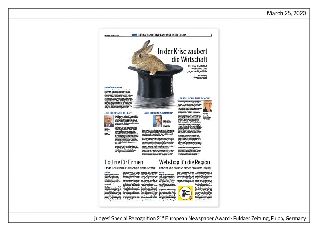
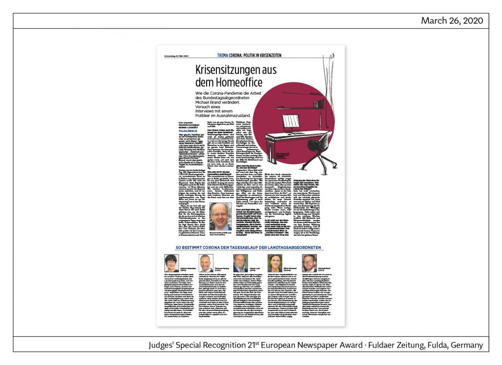
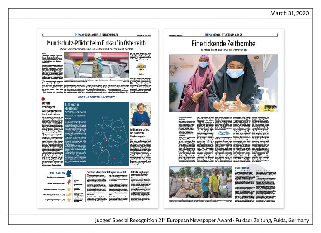
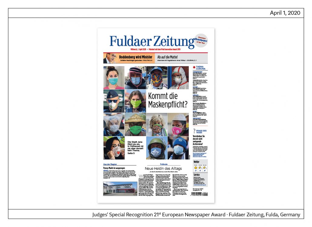
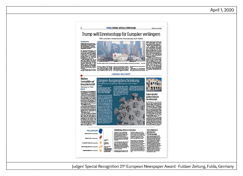
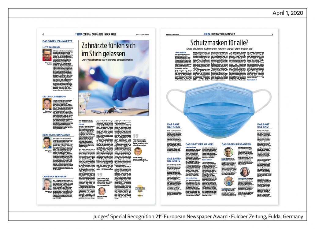
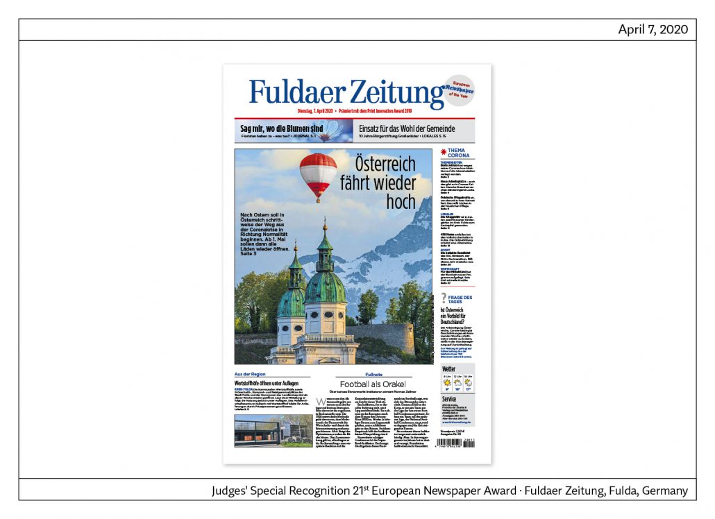
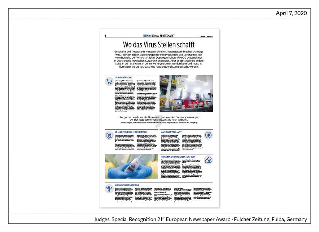
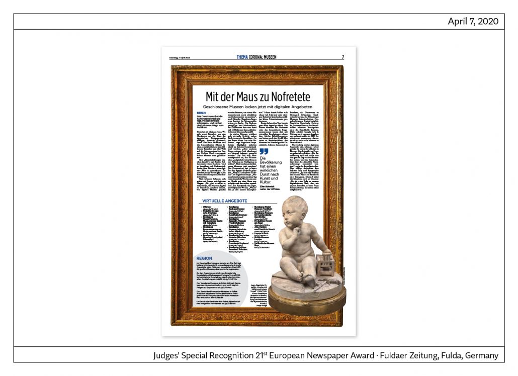
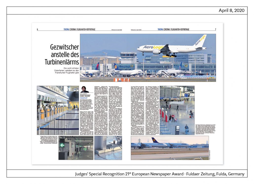
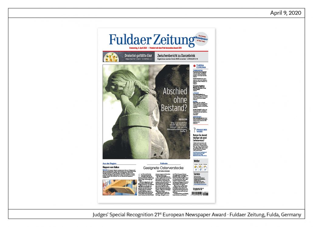
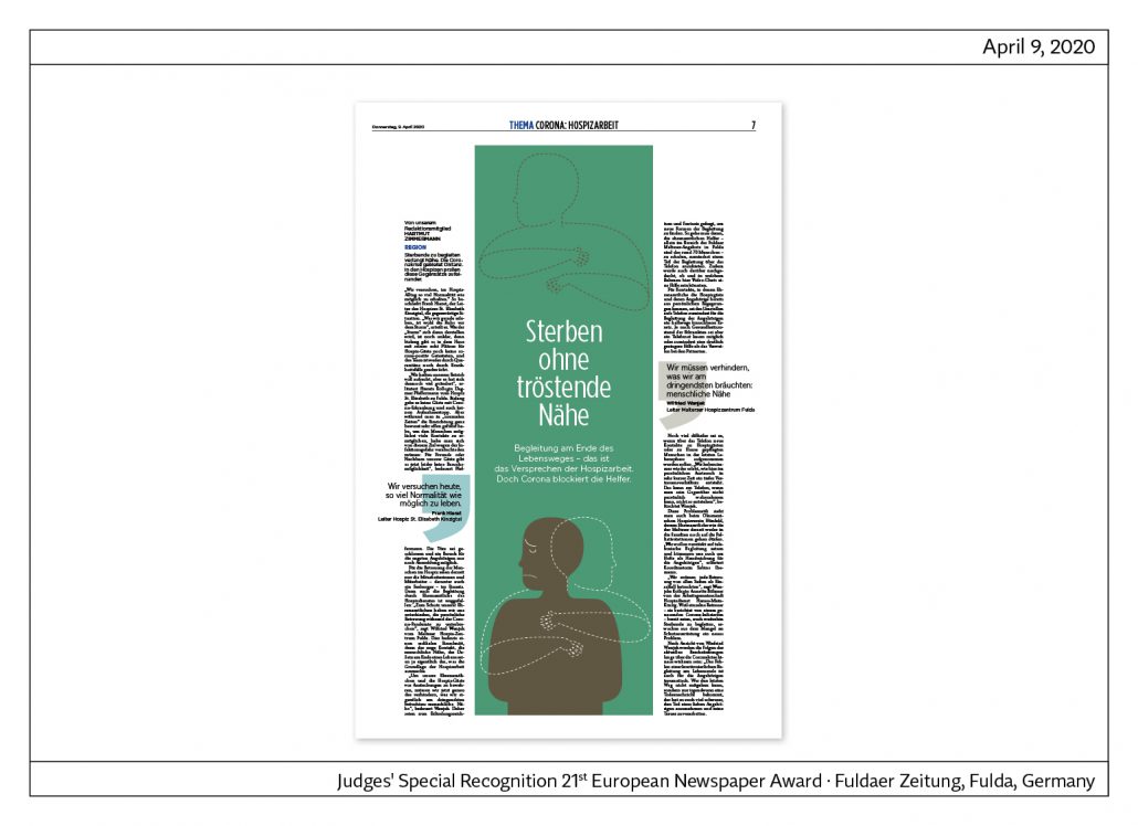
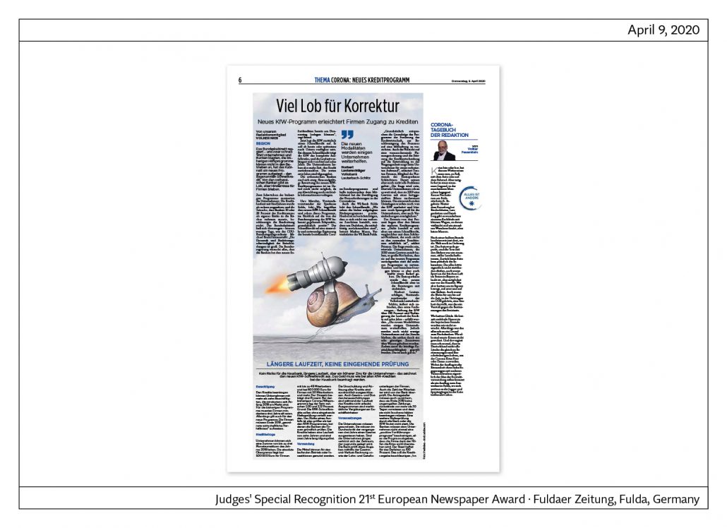
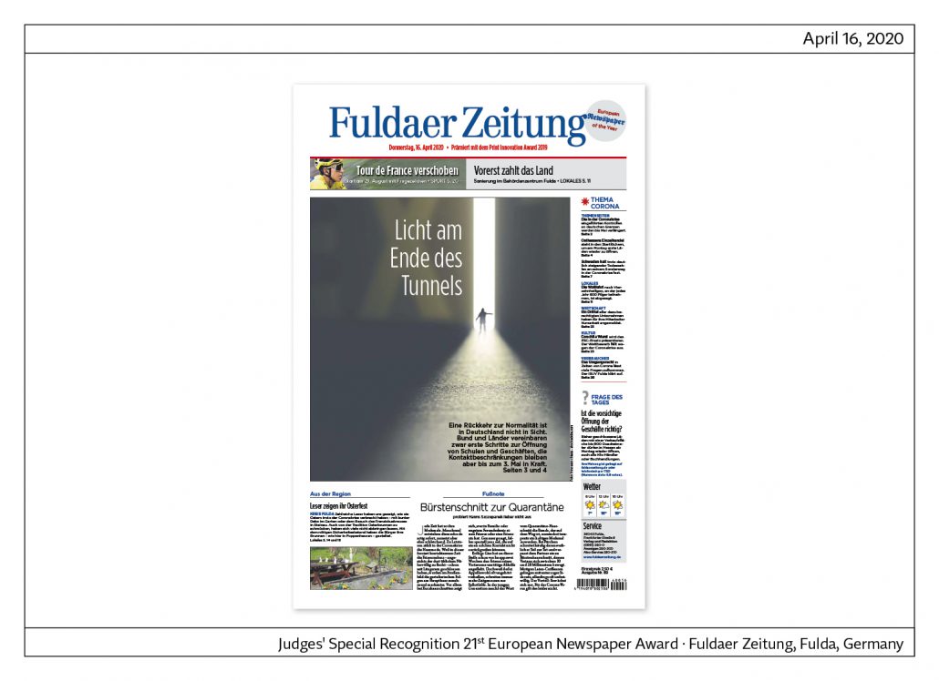
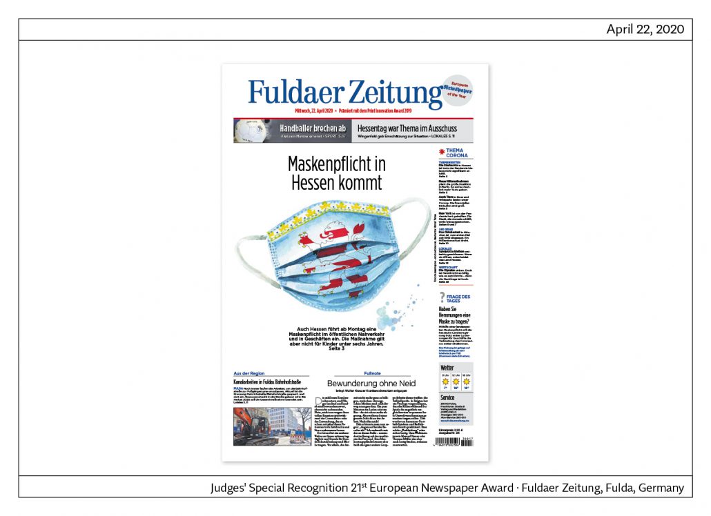
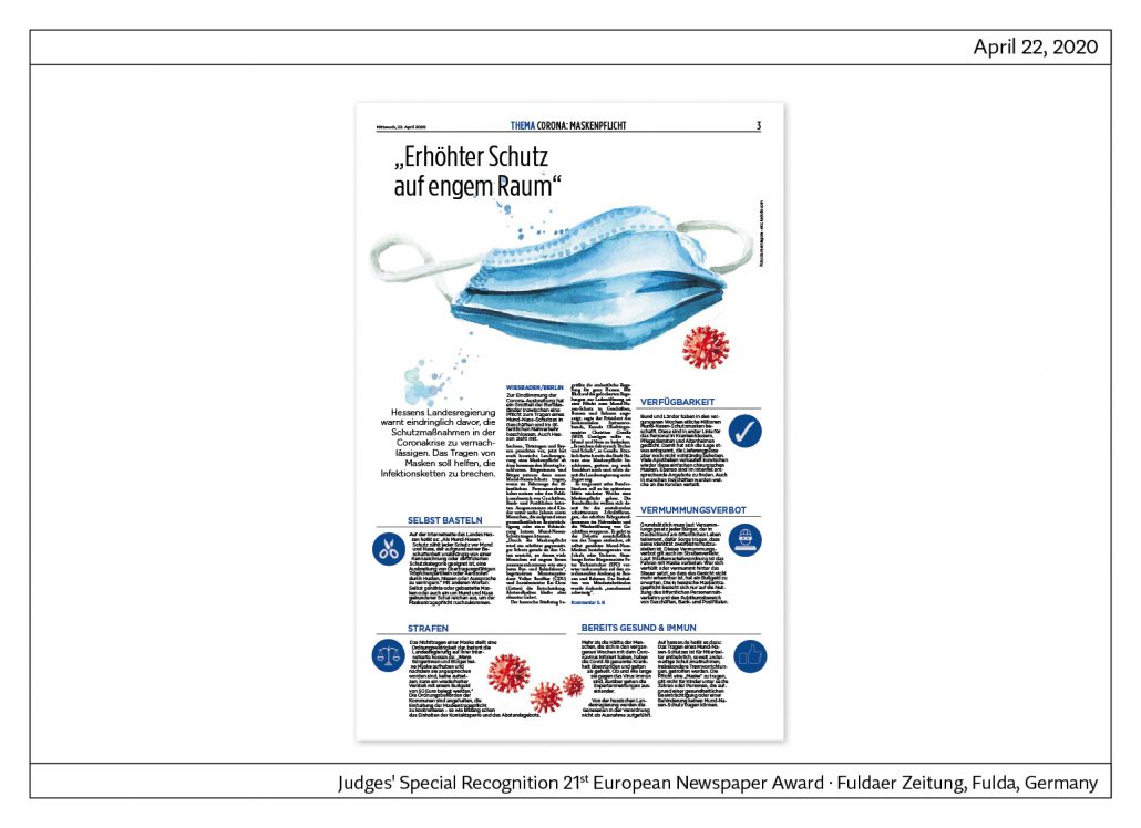
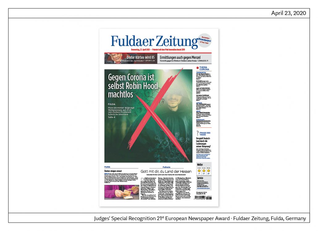
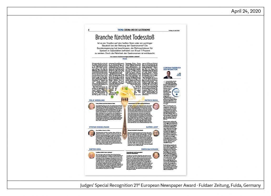
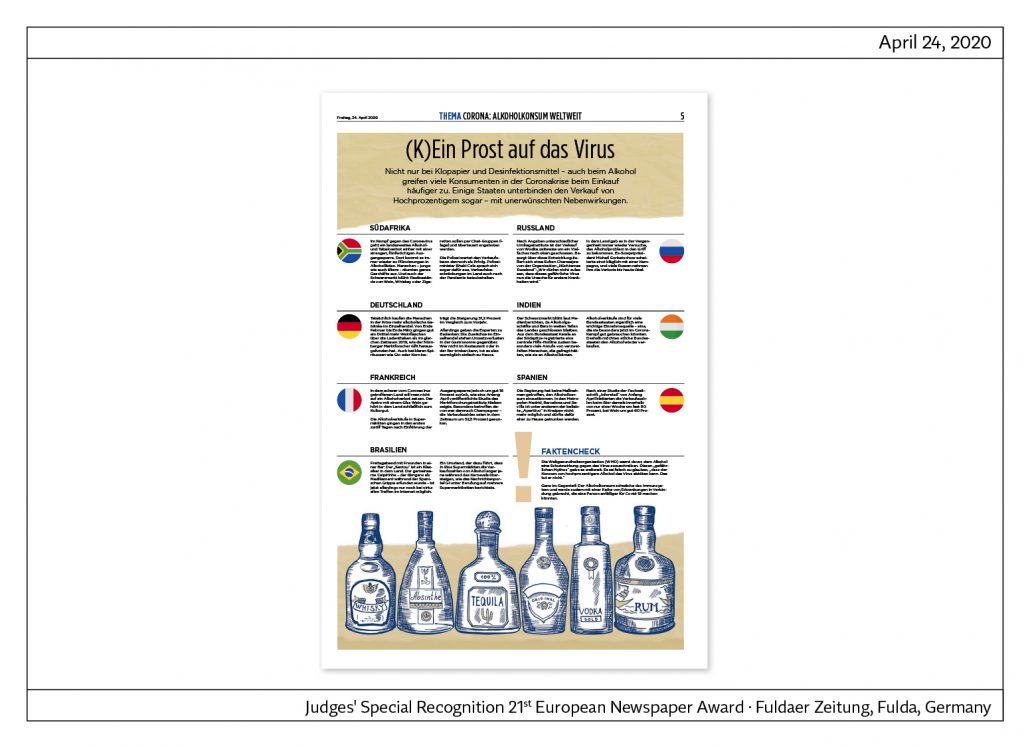
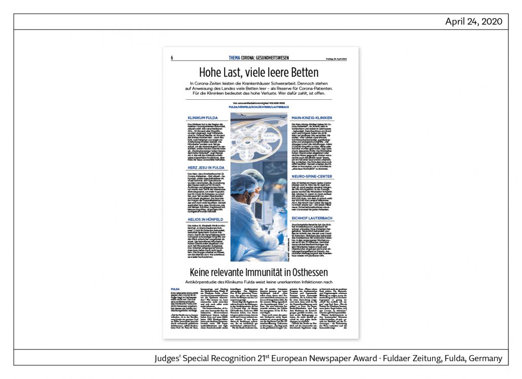
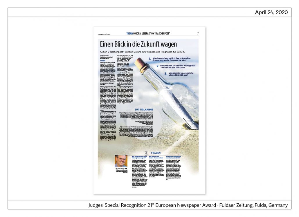
At the bottom of this page are examples of the Fuldaer Zeitung in the Corona crisis.
Cover and cover story
Each day a single topic is emphasized on the cover and presented on one or several inside pages with photos, illustrations and infographics supporting the text material. With these pages Fuldaer Zeitung has achieved a remarkable editorial turn towards visual journalism.
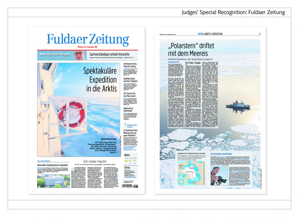
Expedition into the Arctic
The expedition of the research vessel ‘Polarstern‘ (Pole Star) has made it into a cover story. Front and inside pages are dominated by pictures. The article on the inside page is inserted in the overall photo.
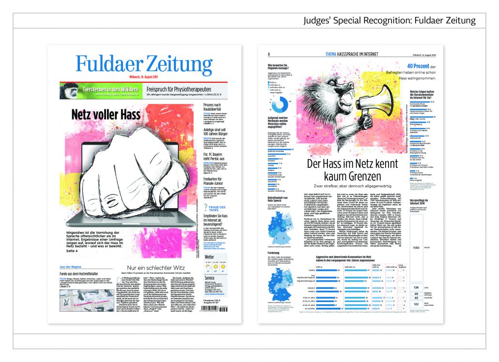
Hate in the Web
The eye-catching elements on these pages are the illustrations. On both sides and at the bottom of the appropriate inside page infographics present the results of opinion polls on the lead topic.
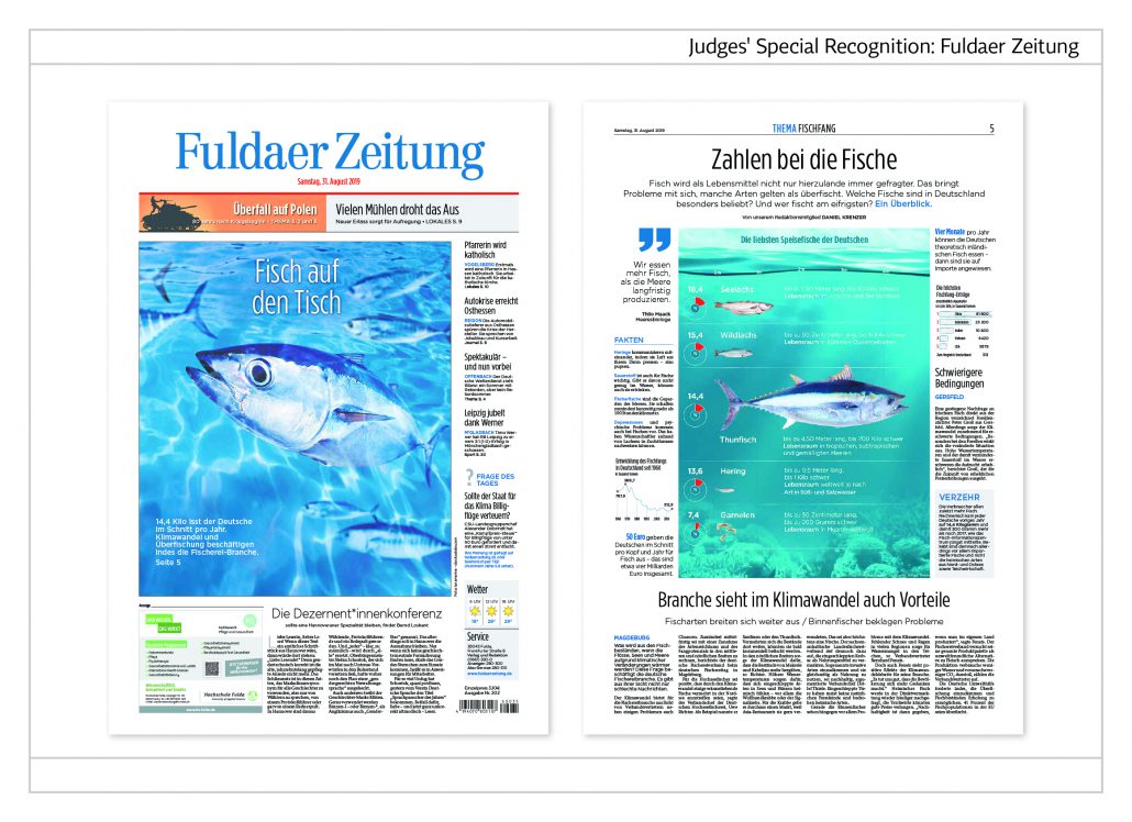
Fish on the table
The German rhyming words (Fisch –Tisch) serve as a catch phrase for the cover story on the topic fish. The centre of the inside page features a photo with an inserted list of the most popular food fish.
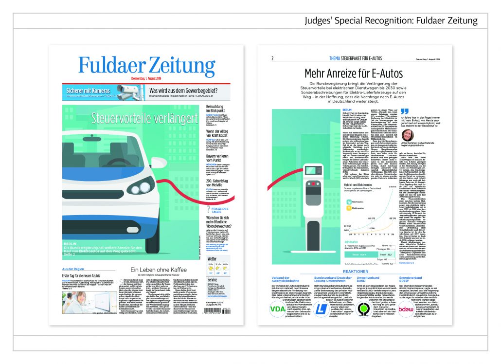
Tax benefit for e-cars
The illustration on the front page is visually connected with the illustration on page 2. The appropriate article is broken up by a quote and infographics.
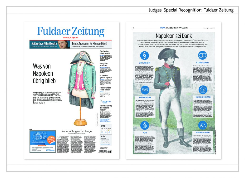
Napoleon’s legacy
The occasion for this cover story was the general’s 250th birthday. The front page exhibits one of his uniforms. The inside page points out what else has been left of Napoleon’s reign. There are, among other achievements, the code of civil law, the registry office, house numbers and the famous house number 4711 which has become a trademark. The page is a model for alternative story telling. The text is divided into six segments according to the six different items of information.
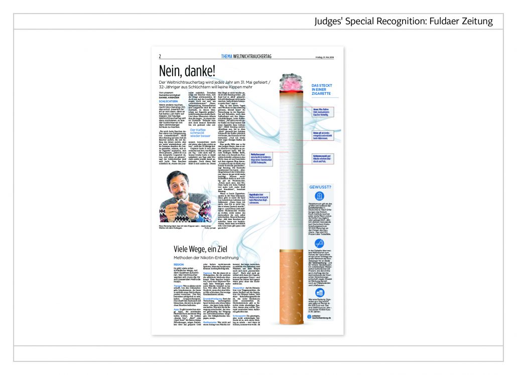
The dangers of smoking
On the occasion of the ’World No Tobacco Day’ a topical page has been designed visualizing a huge lit-up cigarette. To both of its sides the dangers of smoking are explained. The topic is divided into two articles. At the bottom of the page the readers are instructed about how they can succeed in becoming non-smokers.
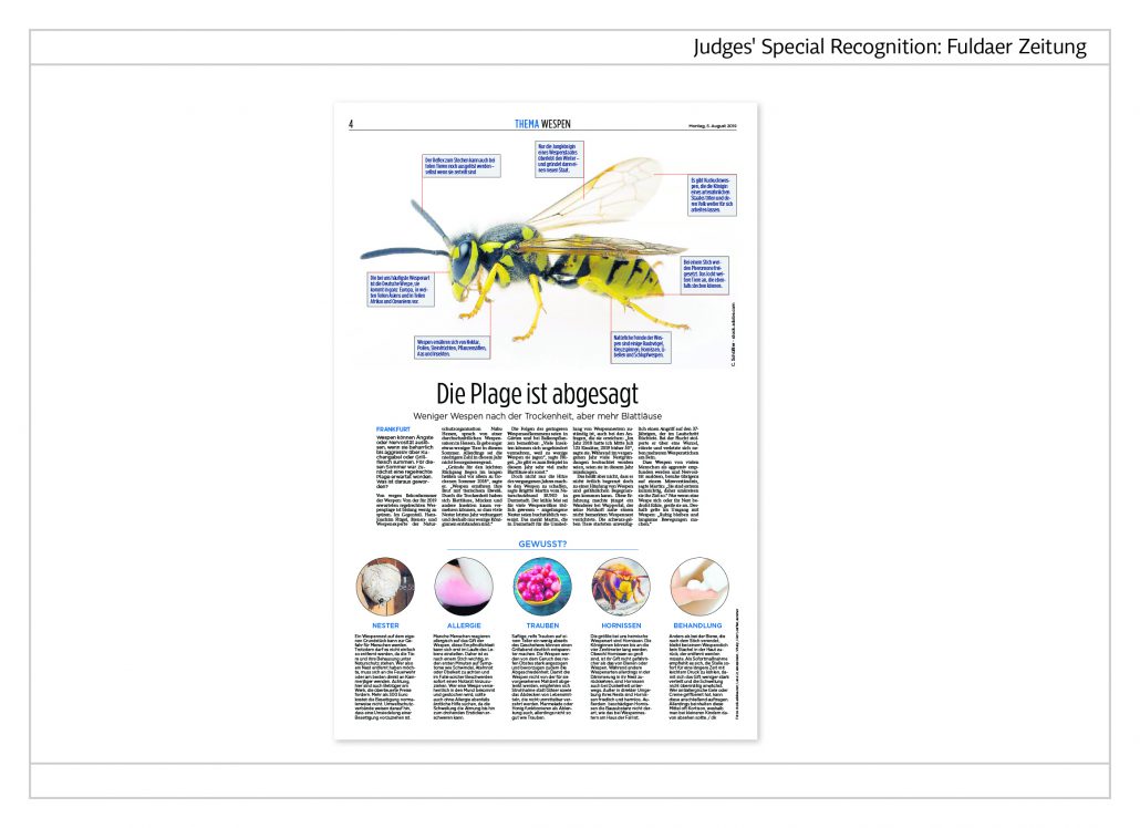
End of wasp plague
The eye-catcher on this page is the big illustration of a wasp encircled by seven bits of information. At the bottom of the page the reader learns five facts about wasps under the headings: nests, allergies, grapes, hornets and treatments.
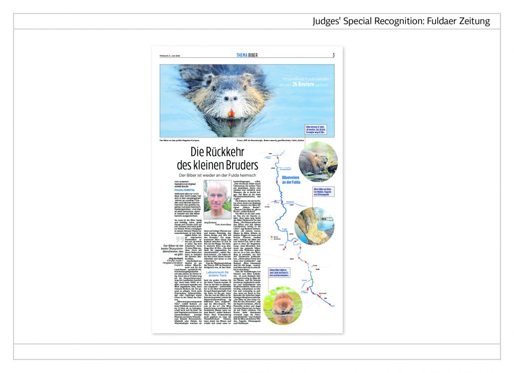
The return of the beaver
A swimming beaver at the top of the page announces the topic. The infographic on the right points out the 26 beaver territories along the river Fulda.
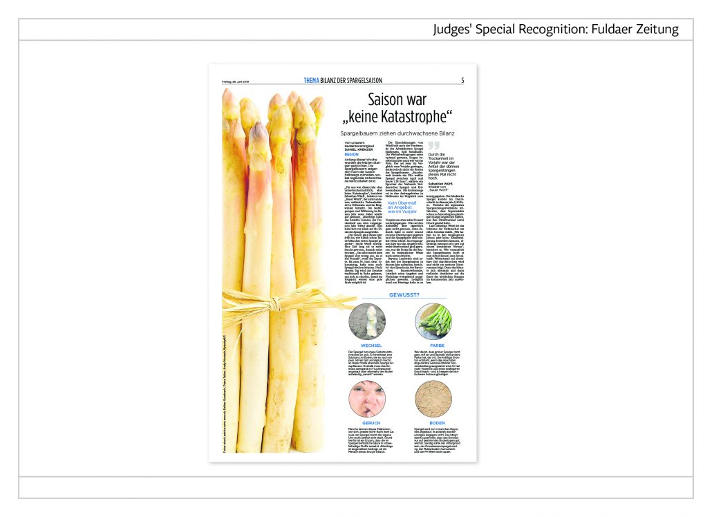
Asparagus
Presented in a vertical position, the bunch of asparagus stems cover half of the entire page. The result of the asparagus season is the topic of the article. The four facts on asparagus under the three columns finish the topic off.
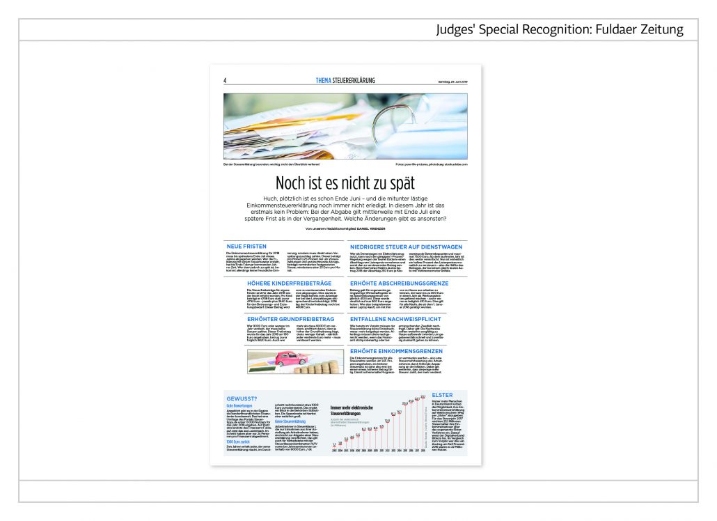
Service – nice and easy
Changes like those about income taxes are usually dealt with in a solid article. ‘Fuldaer Zeitung’ has chosen a different approach. In an alternative story form they structure the essential information into seven segments. At the bottom of the page additional information is provided in a service box. The result is clear and very reader-friendly.
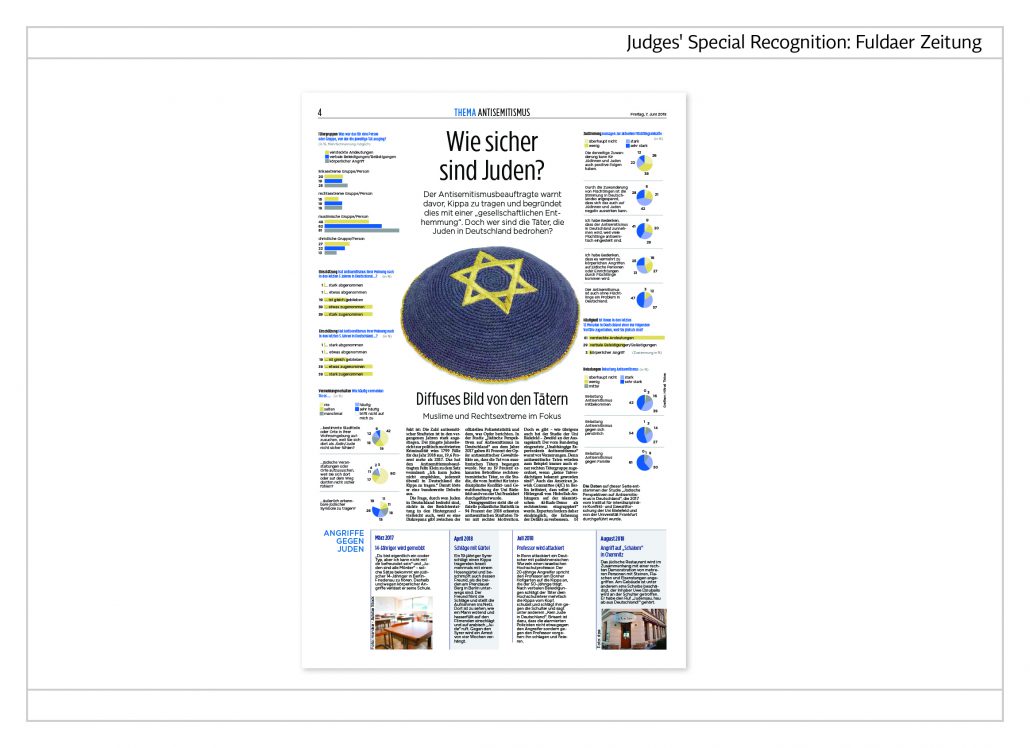
Anti-semitism
The readers’ attention is caught by the picture of a kippah in the centre of the page. The heading reads, “How safe are Jews?” To both sides of the picture are the results of a research into anti-semitism in Germany. Pie charts and bar charts have been used for the statistics.
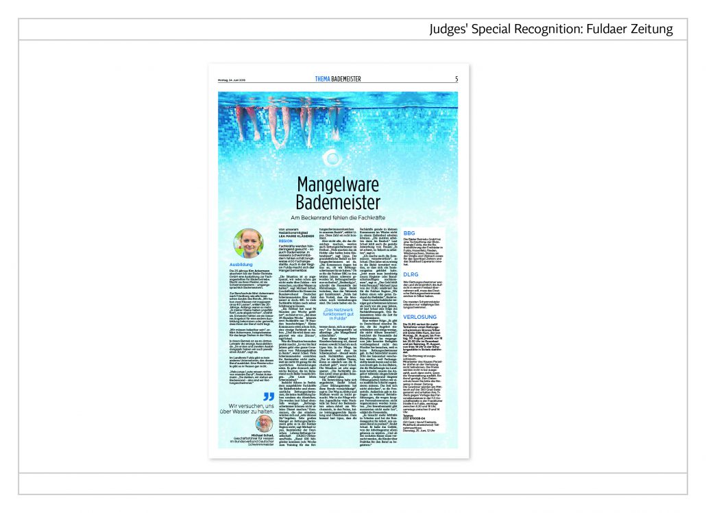
Shortage of pool attendants
The whole page is taken up by an under-water photo of a swimming pool. At the top one can see the dangling legs of swimmers. The visual is simply great and the topic well presented.
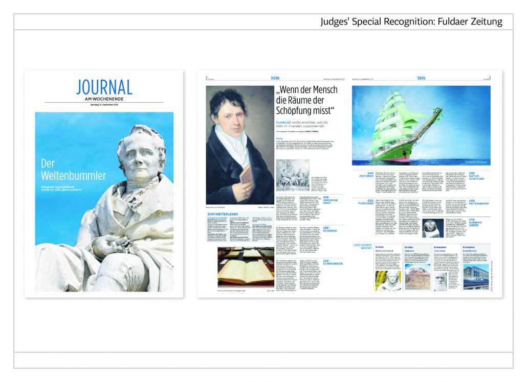
Journal at the weekend
The weekend section has its own cover story. In this issue it is about Alexander von Humboldt.The double-page layout is remarkable. Instead of a complex article, the topic is divided into five big and four small items. So the readers can decide on their own what and how much they want to read.
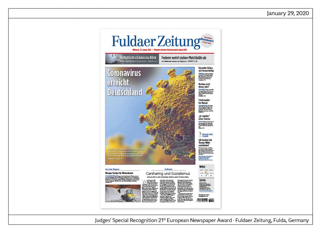
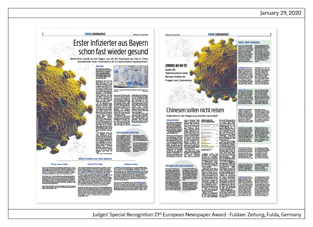
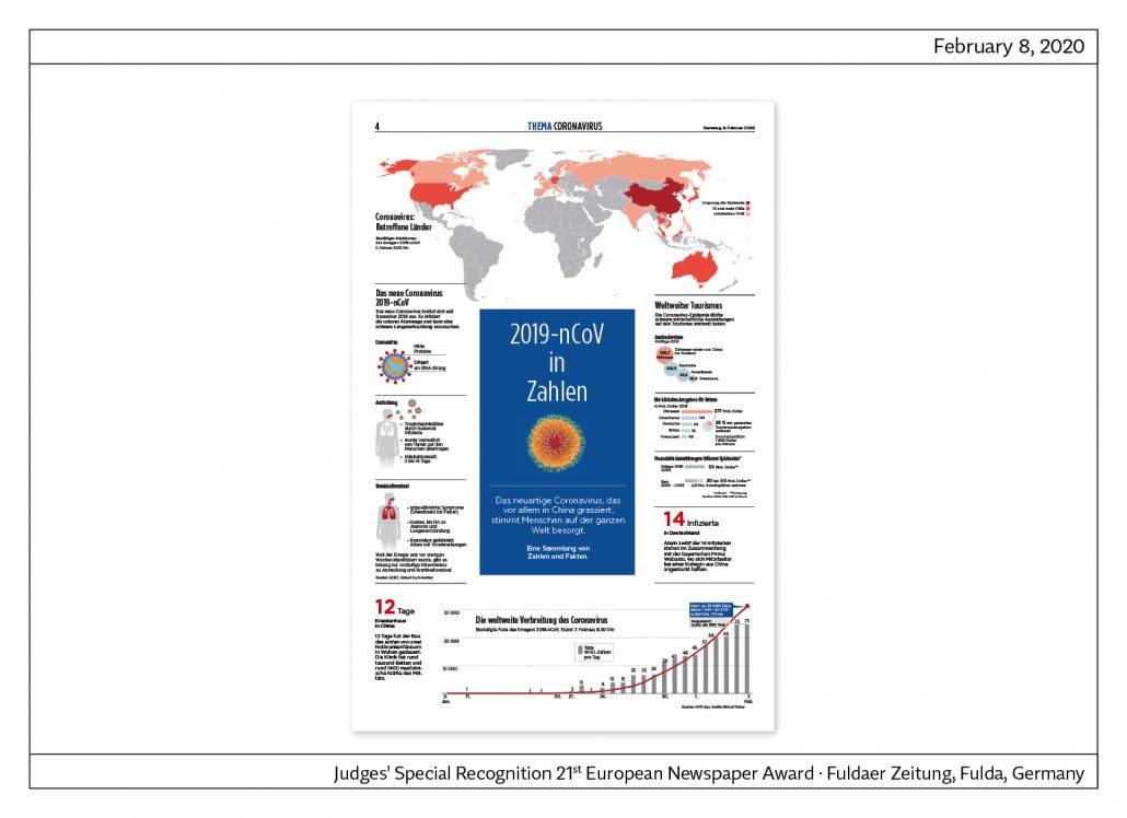
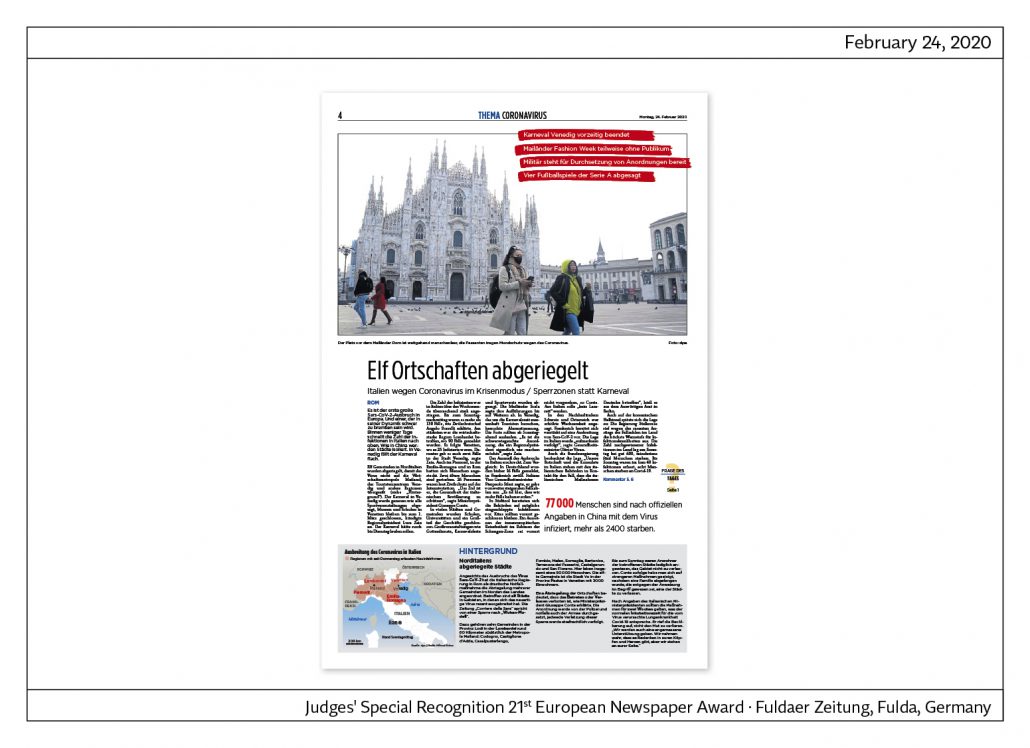
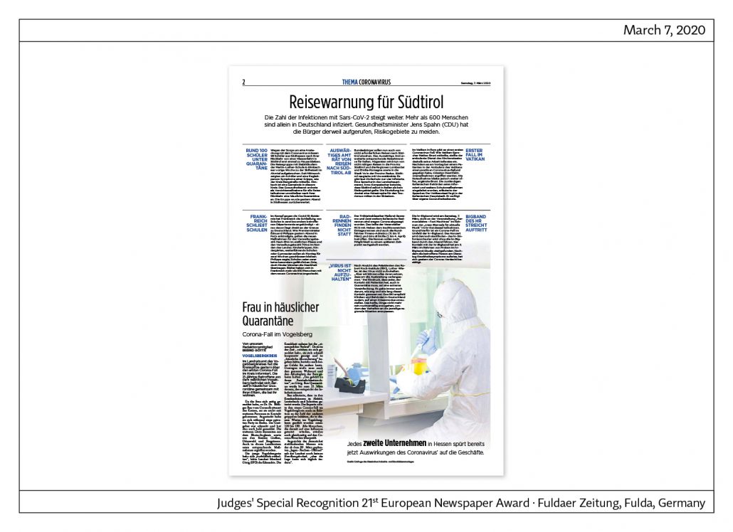
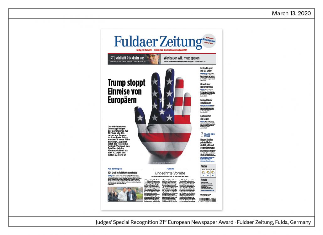
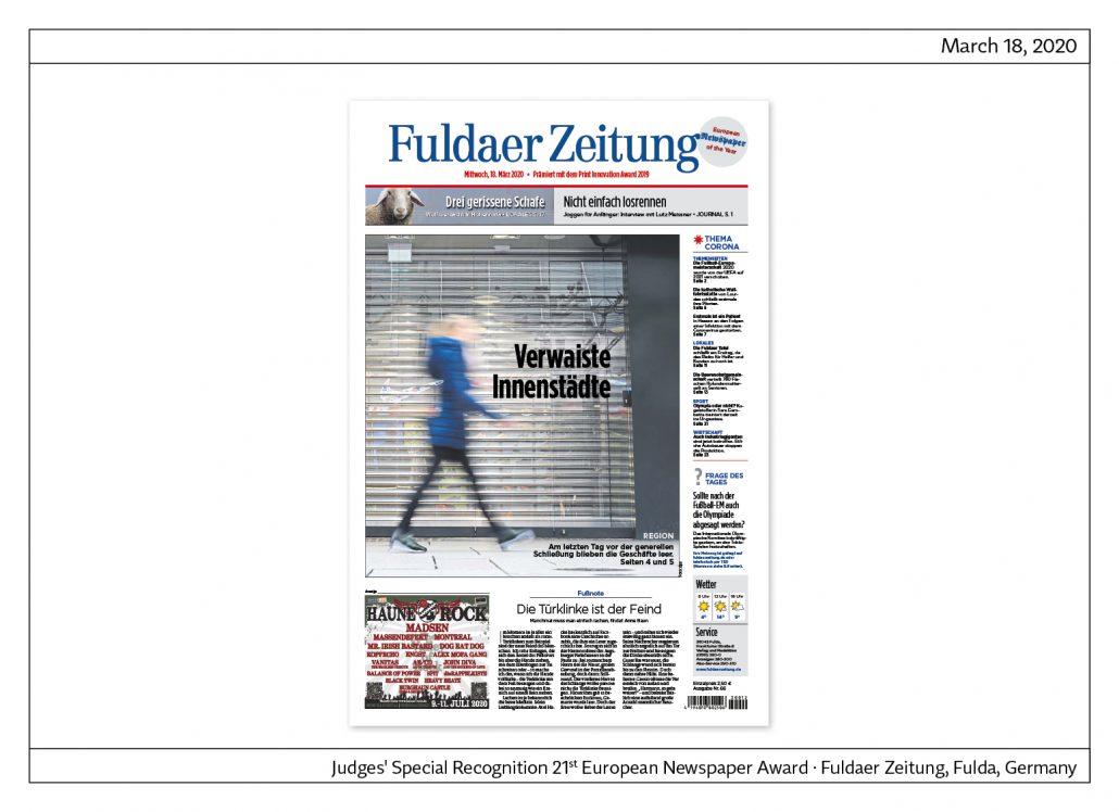
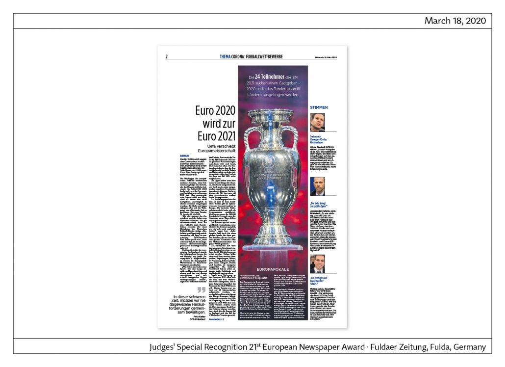
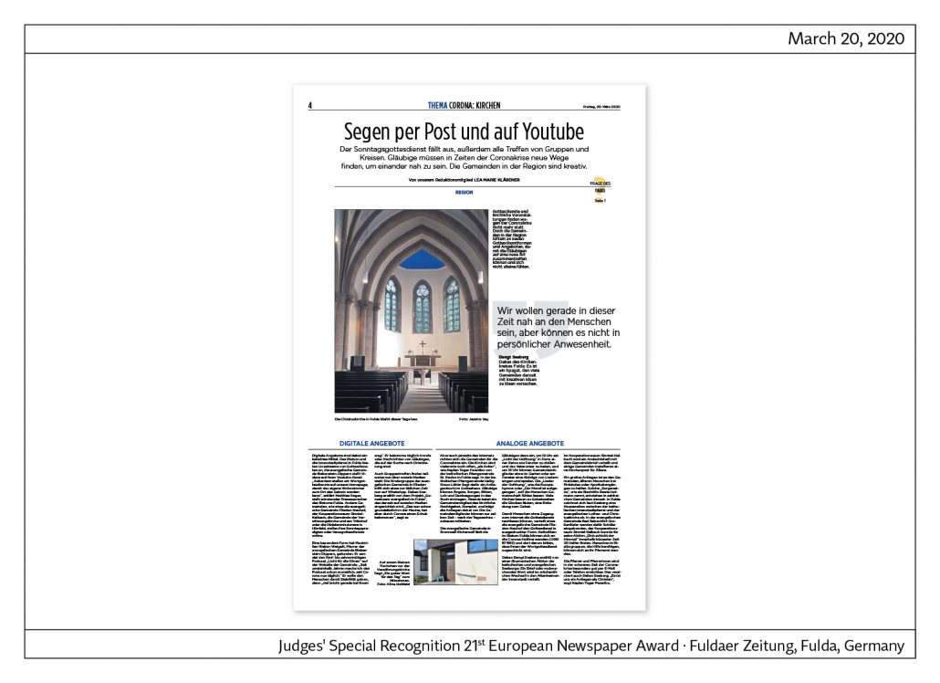
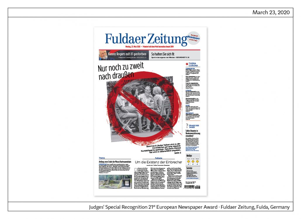
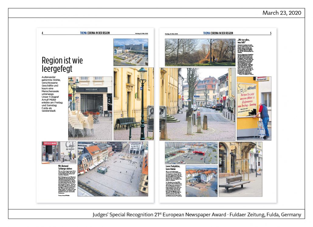
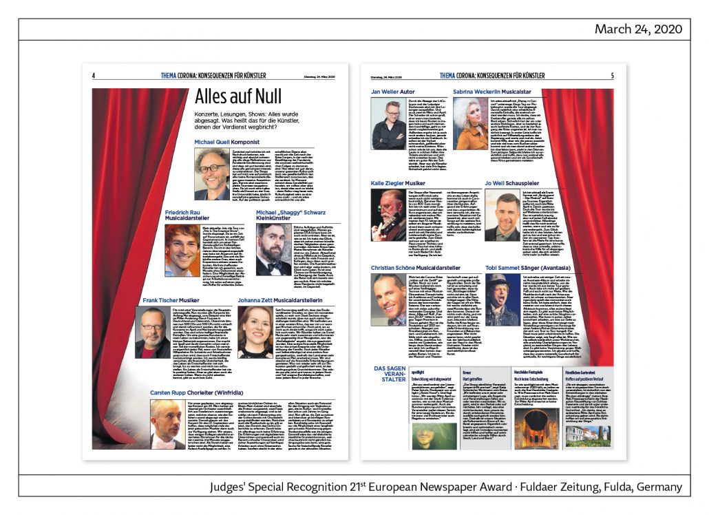
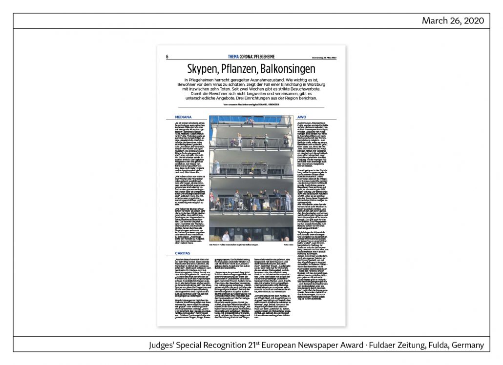
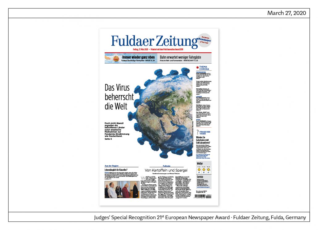
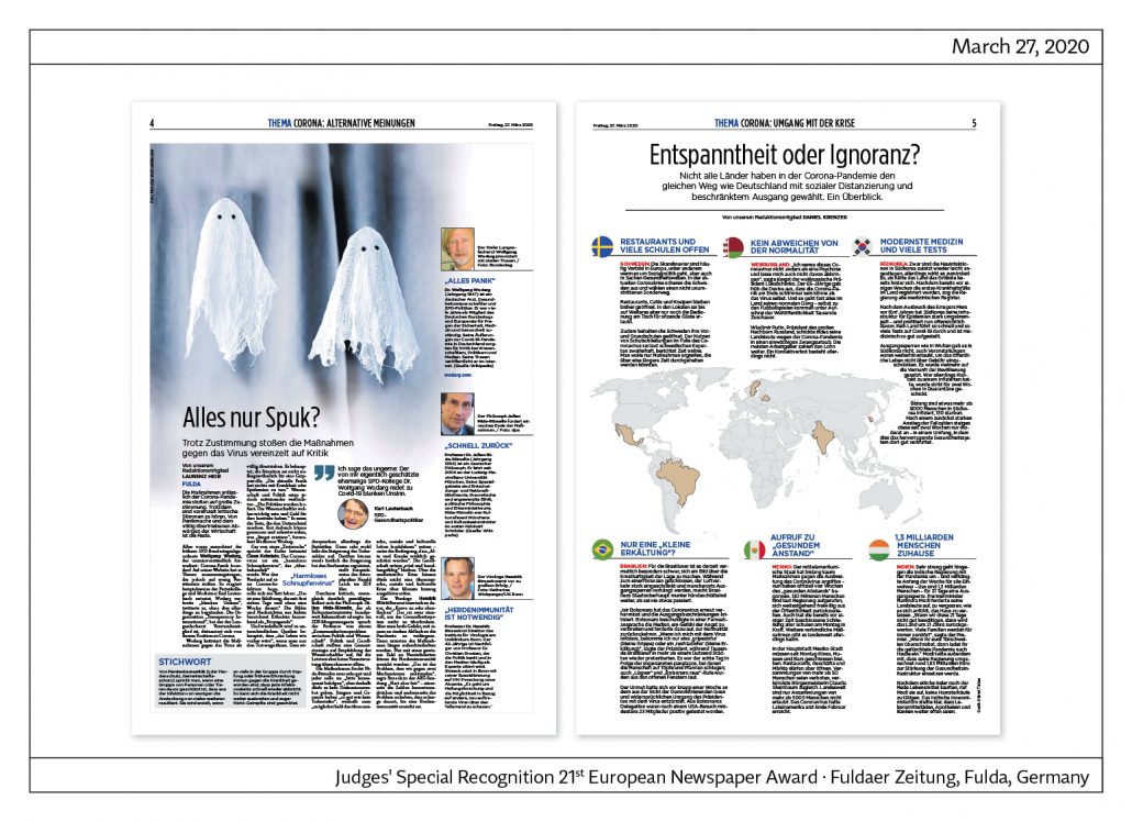
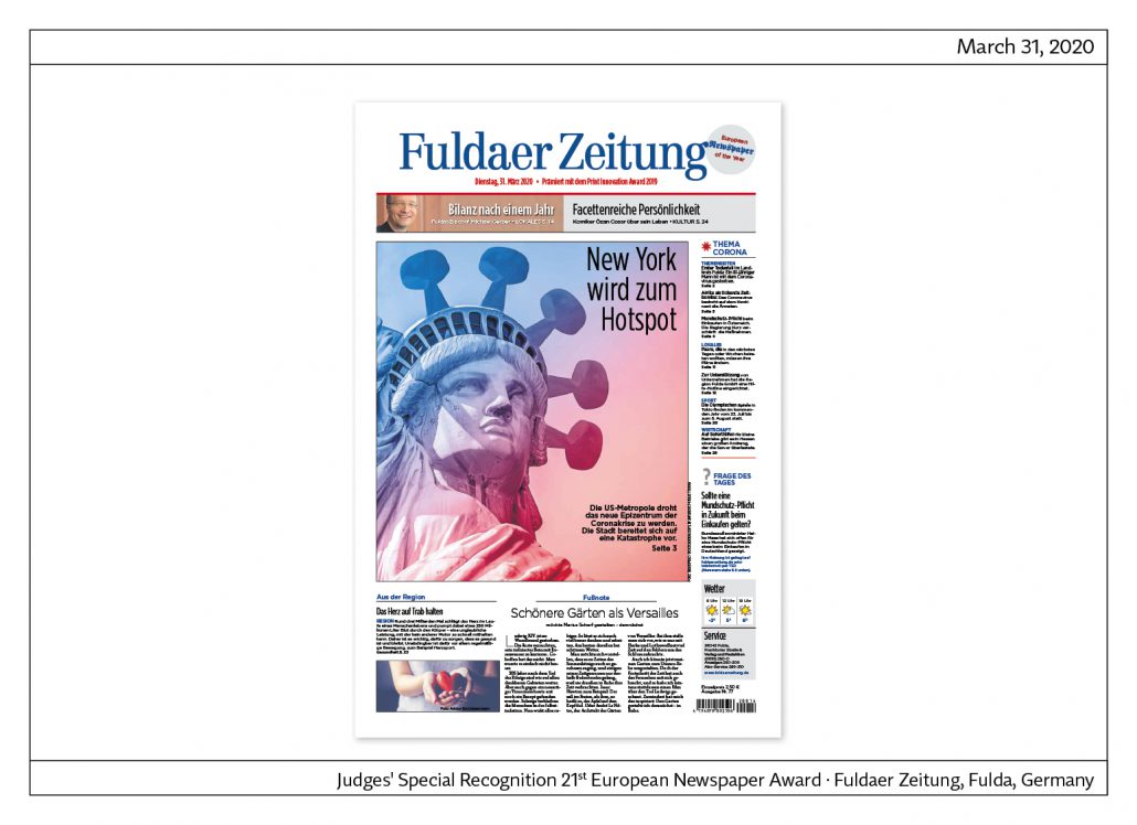
The Fuldaer Zeitung in the Corona Crisis
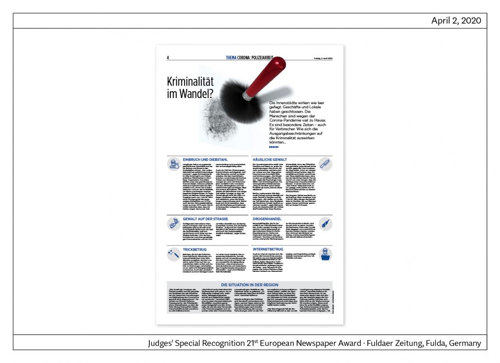
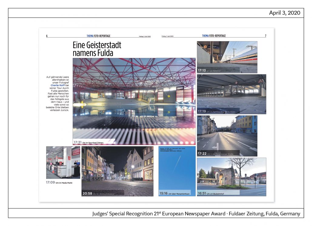
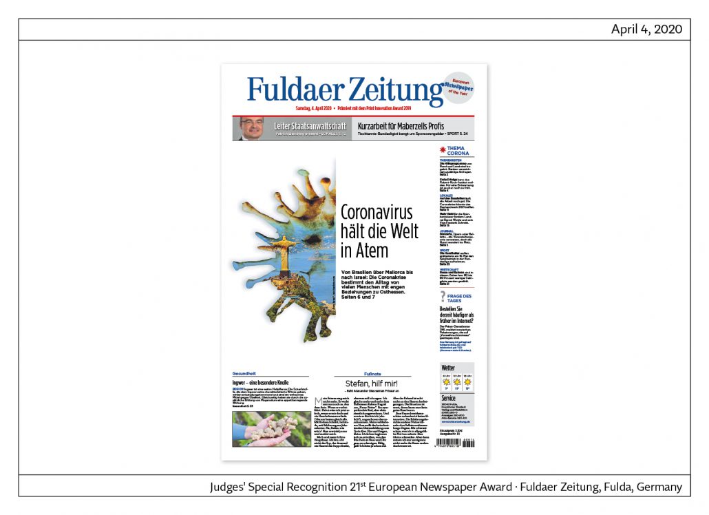
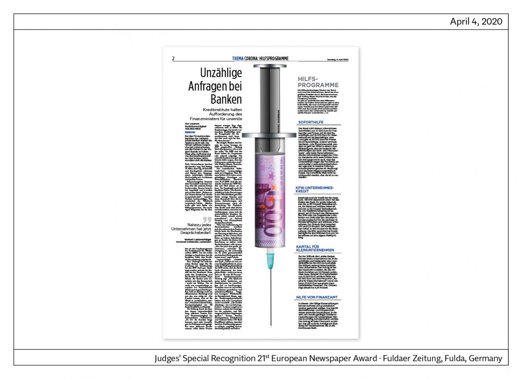
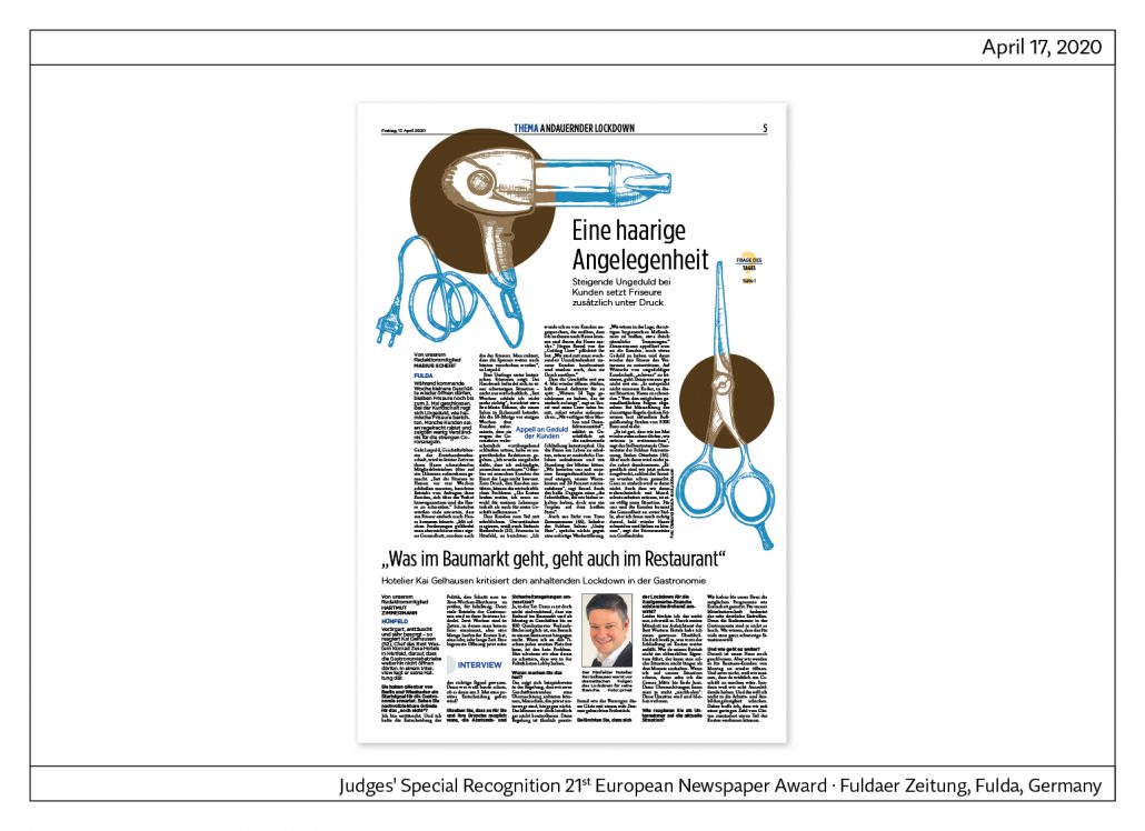
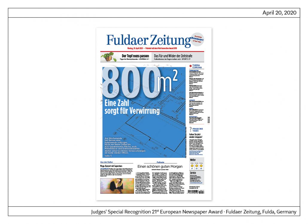
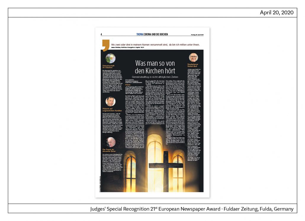
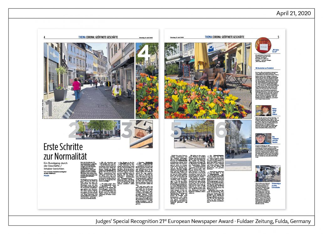
The following pages were created during the Corona crisis. This shows: The special recognition of the Jury was a right decision, because even in the crisis the team of this newspaper shows creativity and strong visual journalism. The goal is always to inform the reader even better.

European Newspaper of the Year: Fædrelandsvennen, Norway
European Newspaper of the Year,
Category local newspaper: Fædrelandsvennen, Norwegen
Jury statement
At first glance striking: the newspaper is picture-emphasized and local topics are placed in the foreground. But Fædrelandsvennen is more than just a local newspaper. There are, for example, the departments of home affairs, foreign
affairs, sports and economy.
Typical of Scandinavian newspapers: content is presented generously. In addition to the dominant image, each large article is enriched with info boxes and other additions, such as quotations. Some topics are presented on two to four pages and enriched with infographics. The typography is modern and used cautiously.
The weekend part is designed as a pull-out. Here, topics are often presented over four to six pages. The newspaper is also very successful online, as almost 40 per cent of subscriptions come from this sector.
About the newspaper
The newspaper appears in tabloid format and is stapled. Fædrelandsvennen has a circulation of around 23,000 copies and together with their digital issues they have 38,000 subscribers. The newspaper employs 41 editors, 2 photographers and 5 layouters.

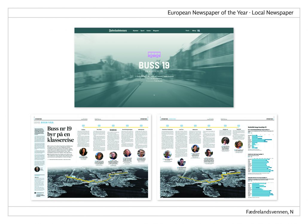
Cross-media project “Our town”
The examples shown here are part of a cross-media project by the name of “byen vår” (our town). In order to present the story in the best possible way, the advantages of both online and print are used. The staff have taken bus no.19 to cross Kristiansand. Reader statements and statistics were used to analyse the different living conditions in the various districts.
Link to the story: https://tinyurl.com/wejbn56
Mads Ommundsen: „At Fædrelandsvennen we are proud to report daily, but we also find room to dig deep and long when history demands it. And when we do, we want the content to shine in print and online.“
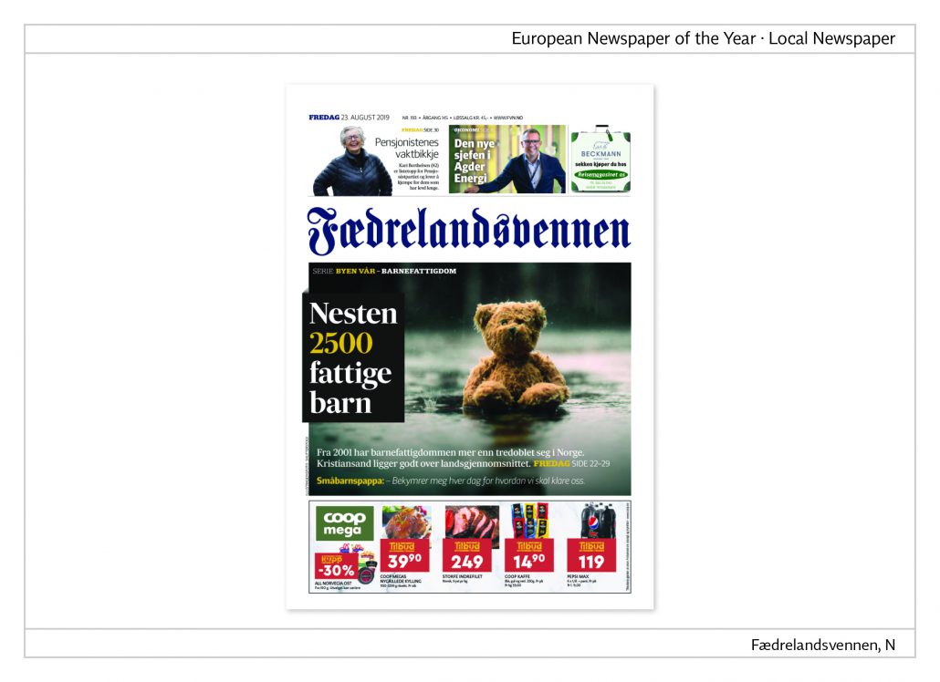
Cover and cover story
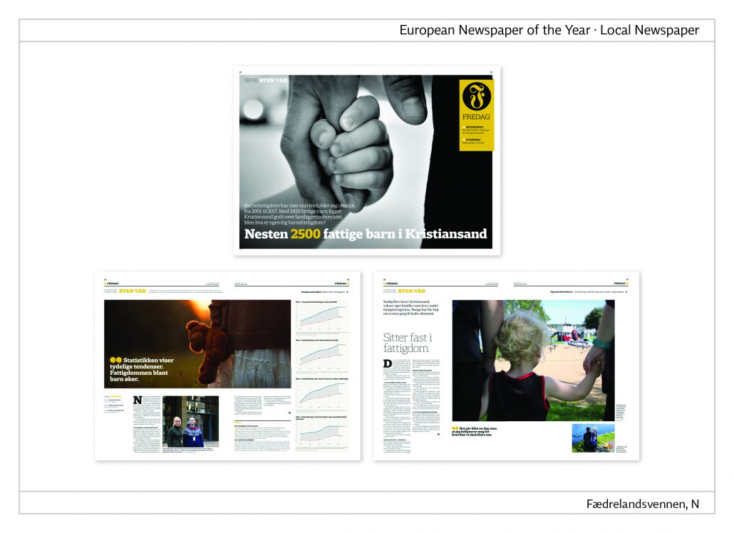
The heading reads, “Almost 2,500 children live in poverty”. The subheading adds, “In Norway child poverty has increased more than three times between 2001 and 2017. With 2,500 poor children, Kristiansand is high above the national average.” The story is continued over four double pages. It combines pictures, text and infographics.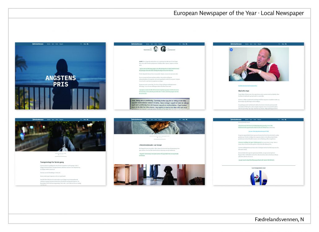
Multimedia story
This is what the staff wrote about this story. “A Norwegian lady living alone in Spain fell ill and spent all her money on the alternative therapy treatment of a gestalt-therapist. But after more than 3,000 hours she hadn’t recovered yet. When we met her, she was destitute and not able to afford any more medical treatment. This is a story worth telling. But it is a long story. In order to prevent the reader from dropping out, we have decided on a special presentation for it. We have used elements like a running taximeter, videos and new headlines to structure the text so as not to lose the readers in the process of communicating the story.
Link to the story: https://tinyurl.com/angstenpris
European Newspaper of the Year: Leeuwarder Courant, NL
European Newspaper of the Year,
Category regional newspaper: Leeuwarder Courant, NL
Jury statement
Already on the front page the newspaper amazes its readers with unusual visual presentations of topics. The lead story is often continued inside on a double page. The tabloid format and the stitching make it possible to deal generously with
pictures. They are often led over the left and right side. All in all, the result is a relaxed magazine-like layout in all sections of this newspaper. The local section is always included as a pull-out in the middle of the issue. At the weekend there is a total of four supplements: local, home and business and the weekend supplement, which has a different layout. The marginal columns on the left and right are particularly striking here. Reports, interviews, background information, food and beverages, multimedia and travel form those columns.
About the newspaper
Leeuwarder Courant is published in tabloid format in the north of the Netherlands. It is stapled. The newspaper has a circulation of around 65,000 copies. 45 journalists and two layouters work on the editorial team.
Front pages
The concept for the front pages becomes clear at first sight: a single topic dominates the page. References to further articles are placed on the right under the masthead. At the bottom of the page the readers can find adverts or multi-column articles.
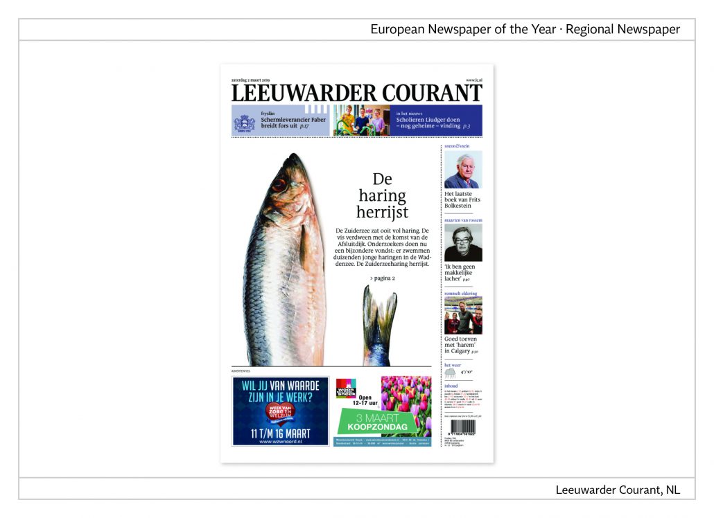
The return of the herring
Once Zuiderzee was rich with herring. But the fish vanished with the completion of the closure dike (Afsluitdijk). Now researchers have found out that thousands of young herring are swimming in the mud flats.
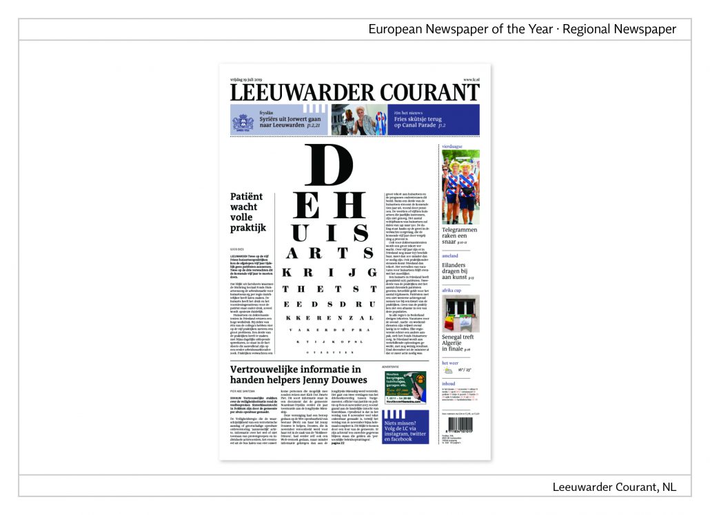
Overworked doctors
Two out of five general practitioners in Friesland were unable to accept new patients during the past five years because of an overload of work. The visual shows an eye-test table.
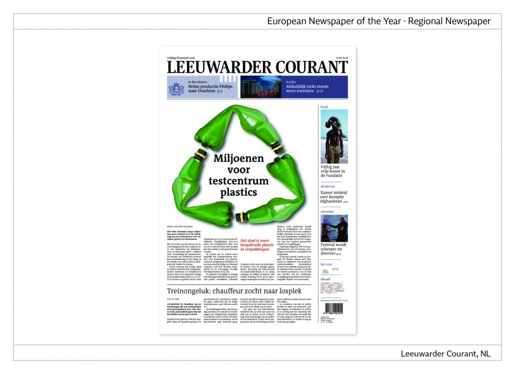
Millions for a synthetic material test centre
Friesland invests millions of euros in a centre for the research of the circular economy of synthetic materials. In order to visualize this topic, green plastic bottles have been arranged to form the well-known logo for recycling.
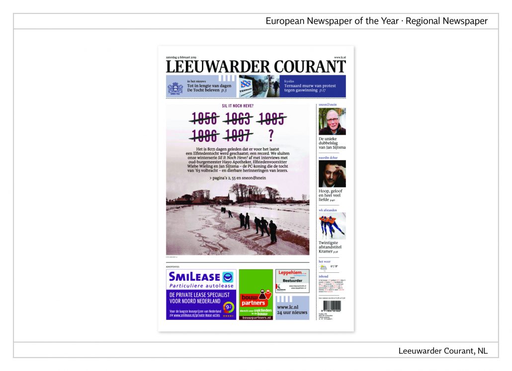
1997 was the last year of the eleven-cities tour
‘The eleven-cities tour’ is the term for a long-distance ice-skating race on natural ice surfaces. The last race took place 8,071 days ago, which is a new record.
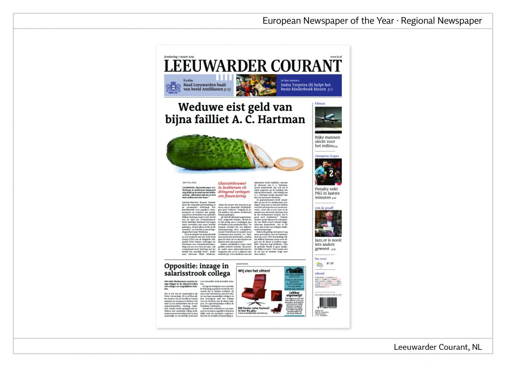
Greenhouse builders in economic straits
The greenhouse builder Hartman is on the verge of bankruptcy. “Maybe we will cease to exist within the next two weeks.” The idea of a cucumber sliced into euro coins is well chosen to visualize this problem.
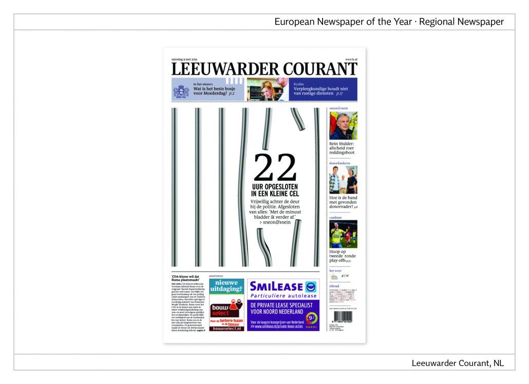
22 voluntary hours in prison
A woman journalist decided to be taken into police custody for 22 hours. In the weekend column she describes the emotional impact of her experience, which is visualized by metal bars, two of which are bent and torn apart.
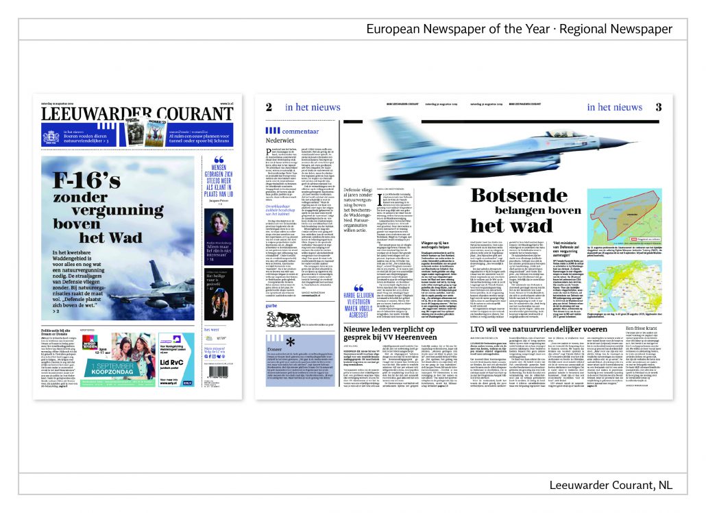
Cover and cover story
“The F-16 without permission over the mud flats”, is the headline. The motif from the front page is continued on an
inside page and part of a strategy to give the readers orientation. The repetition of motifs, colours and similar elements of design indicate the coherence of topics spread out on different pages.
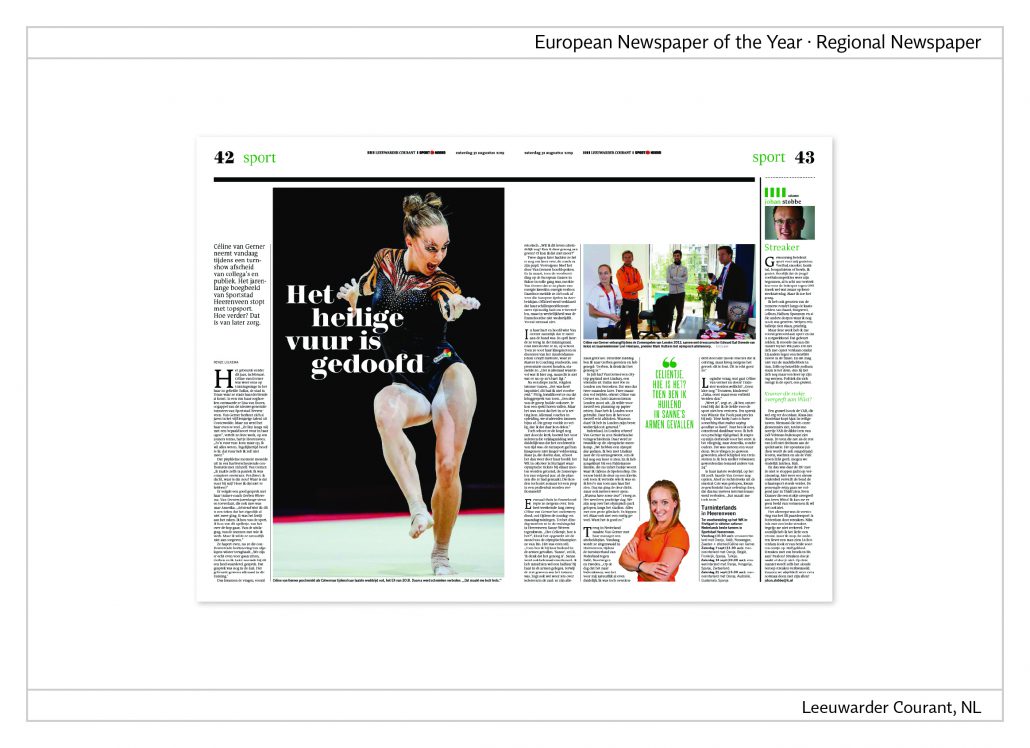
Double page
The sports section starts with a large vertical photo as the opener to a story whose white headline is inserted in the dark background of the picture. The right page with the main body of the article serves room in the centre for a variable column with a quote and a cut-out portrait. The generous white space on this double page is well balanced.
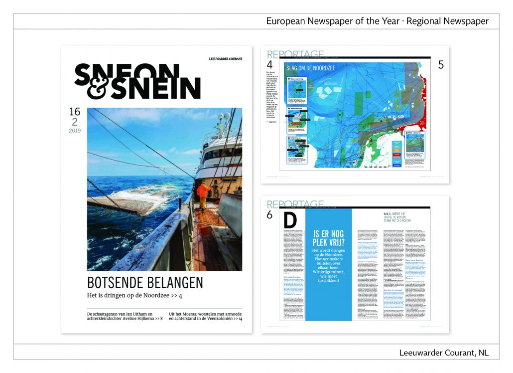
Weekend section
“Contradicting interests”, reads the headline on the front page, added by the subhead, “Crush in the North Sea”. The article is about the lack of space with so many different activities and claims: nature protection, bird sanctuaries, fishing, shipping, military, and wind power stations. Bit by bit the North Sea is marked off as indicated on the map on the second page.
European Newspaper of the Year: Público, P
European Newspaper of the Year,
Category nationwide newspaper: Público, P
Jury statement
What is striking about Público is its handy, reader-friendly format. The title page is always dominated by a large picture. The inside pages are often laid out over double pages. The newspaper focuses on the big themes and also on a generous layout with reduced use of colour and typography. The result is clarity and simplicity. Público looks like a daily weekly newspaper. Topics of the day –“Destaque” – usually occupy the first seven pages of the newspaper, giving the reader an overview.
Of course, infographics are part of the everyday program. They are very clear in print and online and have a subtle use of colour.
Público has also won several awards in the online categories, especially in the fields of infographics, animated infographics and data journalism.
About the newspaper
Público is published with a circulation of 31,500 copies. The newspaper is produced in tabloid format, stapled and trimmed. The online edition is considered the most successful in Portugal and is also popular in Latin America. The newspaper employs 114 journalists, 8 photographers and 14 designers (digital and paper), and 4 infographics designers (digital and paper).
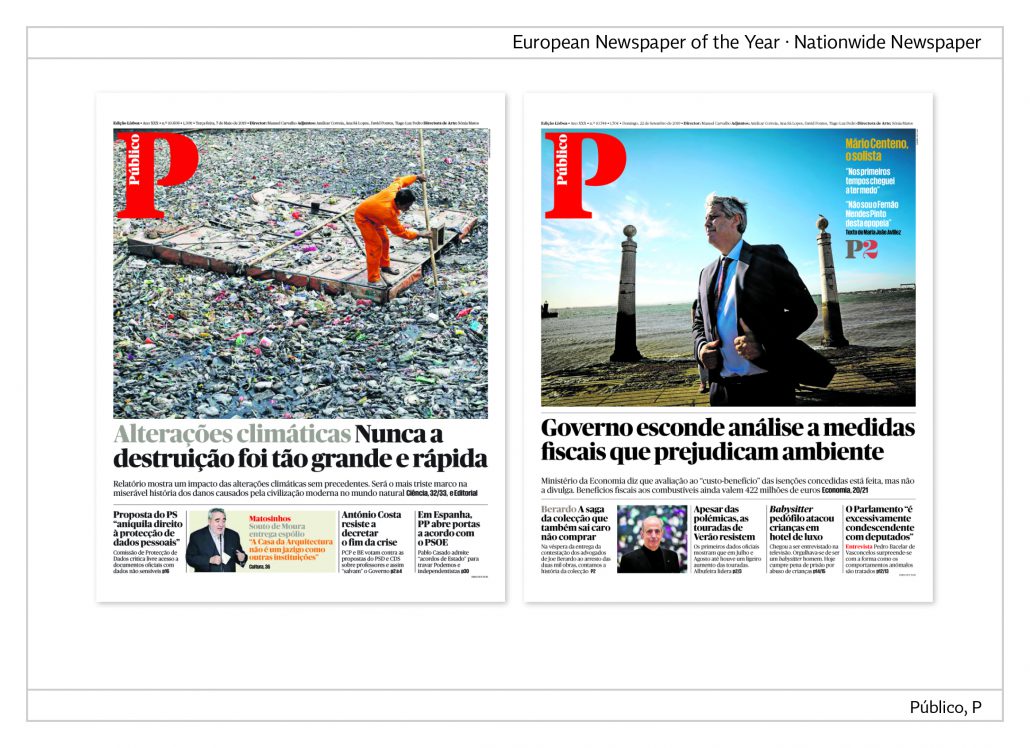
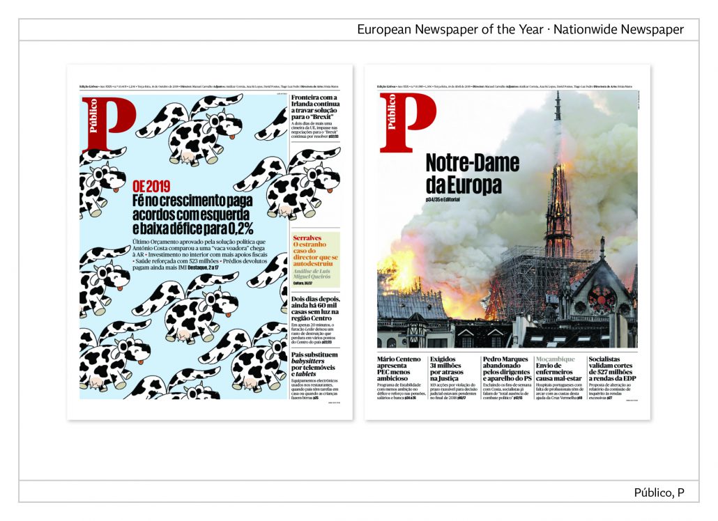
Front page
The front page is almost completely covered by a lead picture with the masthead reduced to the large red capital P in the top left corner and the full name of the newspaper printed in white within the P. The headline is either placed below the picture or inserted in it.
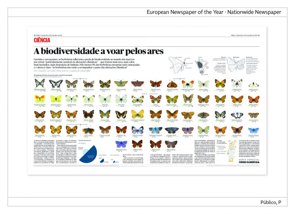
Science
“A diversity of species is flying through the air”, reads the headline.The lead-in adds, “Butterflies mirror the loss in the diversity of insects since they are especially sensitive against the change in climate. At least 9% of European butterflies are endangered and the warning cannot be more accurate: butterflies cannot cope with the change in climate.” The butterflies depicted on the double page indicate the 60 different kinds whose home is Portugal.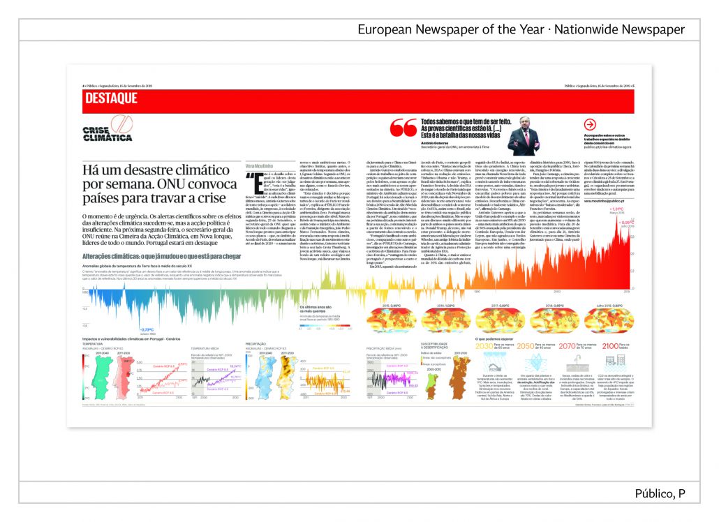
Climate crisis
This double page is devoted to the topic climate crisis. The temperature curve in the centre demonstrates the worldwide
development of temperatures from 1880 until today. It is obvious that the temperatures have risen.
The quote at the top right by António Guterres, UN general secretary, points out, “We all know what is to be done. The scientific evidence is there. […] this is the fight of our life.“
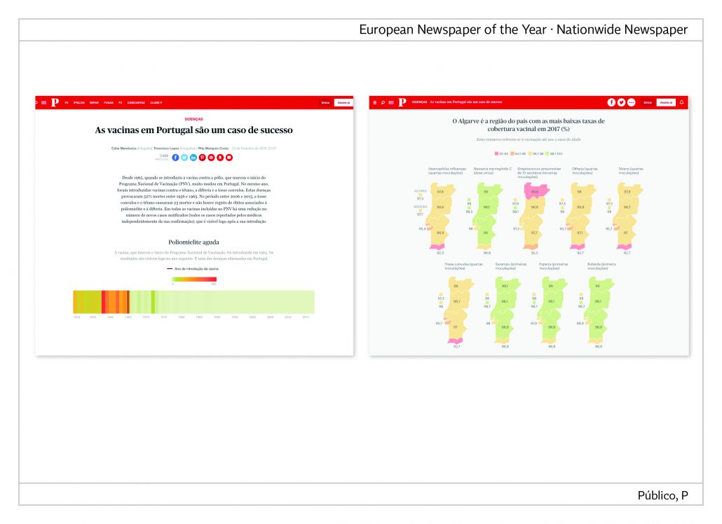
Data journalism
The use of vaccines in Portugal is the topic of these online infographics. In 1965 vaccines against polio, tetanus, diphtheria and whooping cough had been introduced. The bar charts mark the year of the introduction of the appropriate vaccines, after which the illnesses only rarely reappeared.
Link: https://tinyurl.com/wgtnyqf
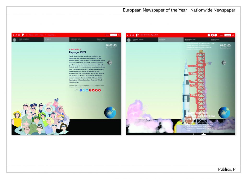
Animated infographics
50 years of flights to the moon is the topic of the animated infographics. The entire space mission is depicted in graphics and supported by inserted pictures, films and texts. In the end the readers are provided with further detailed information about space capsules, spacesuits, and the astronauts themselves.
Link: https://tinyurl.com/tups62u
Público during the Corona crisis
The following pages show front pages that were created during the Corona crisis. The final part is a data journalistic project that lists the number of corona cases by city.

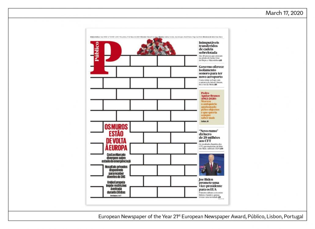
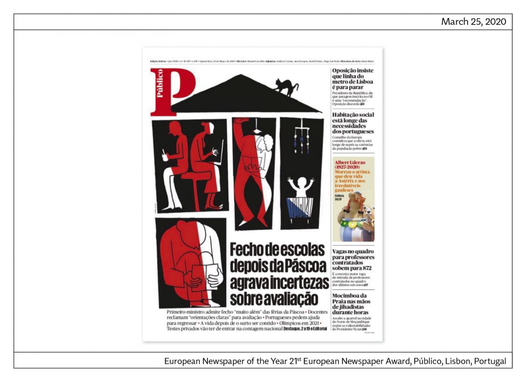
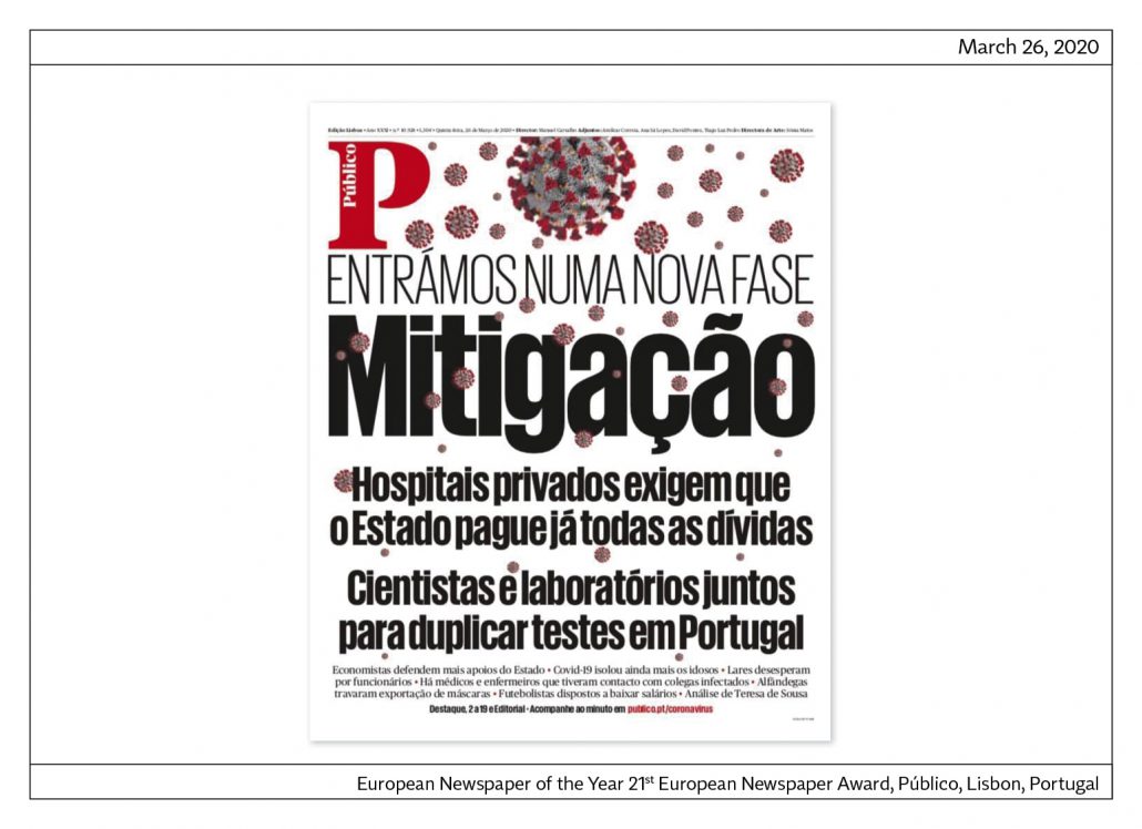
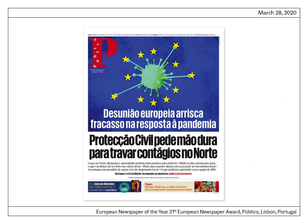
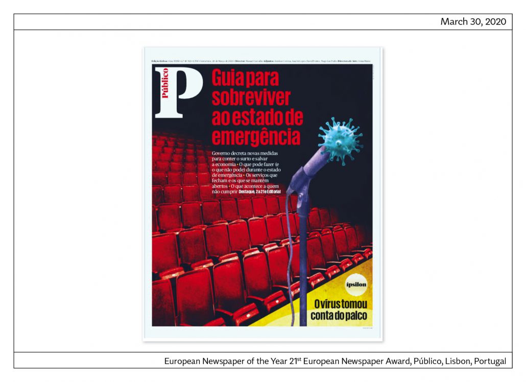
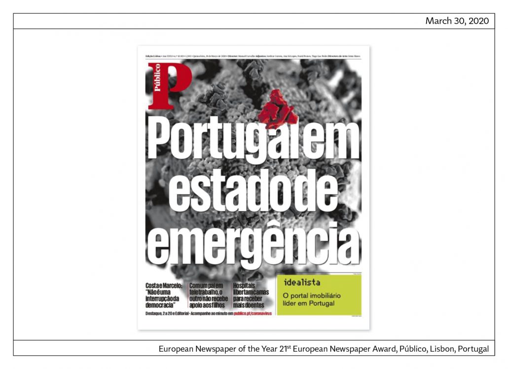
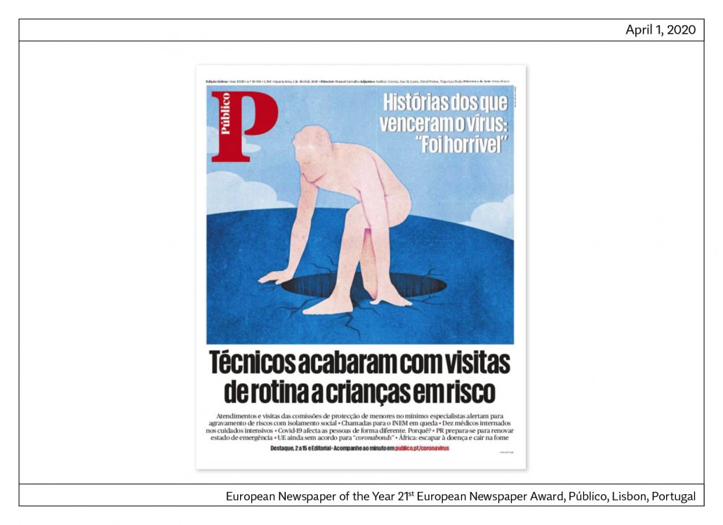
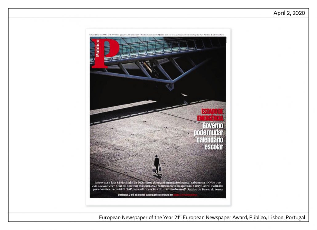
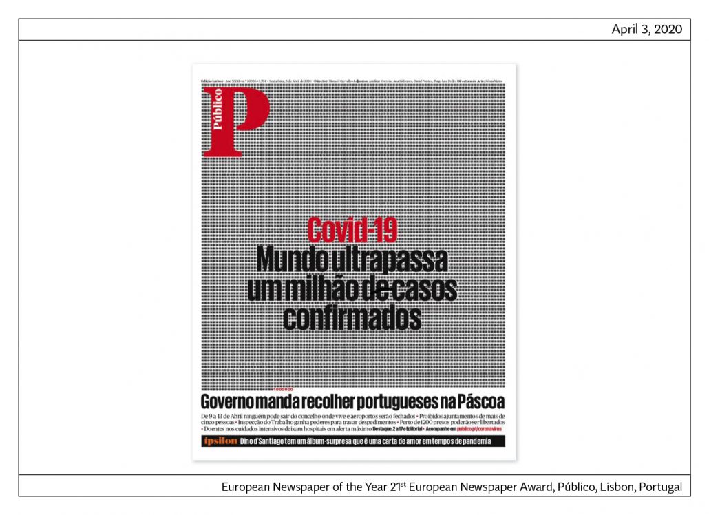
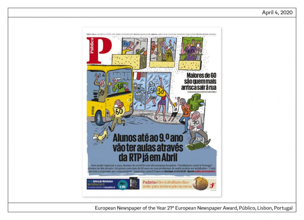
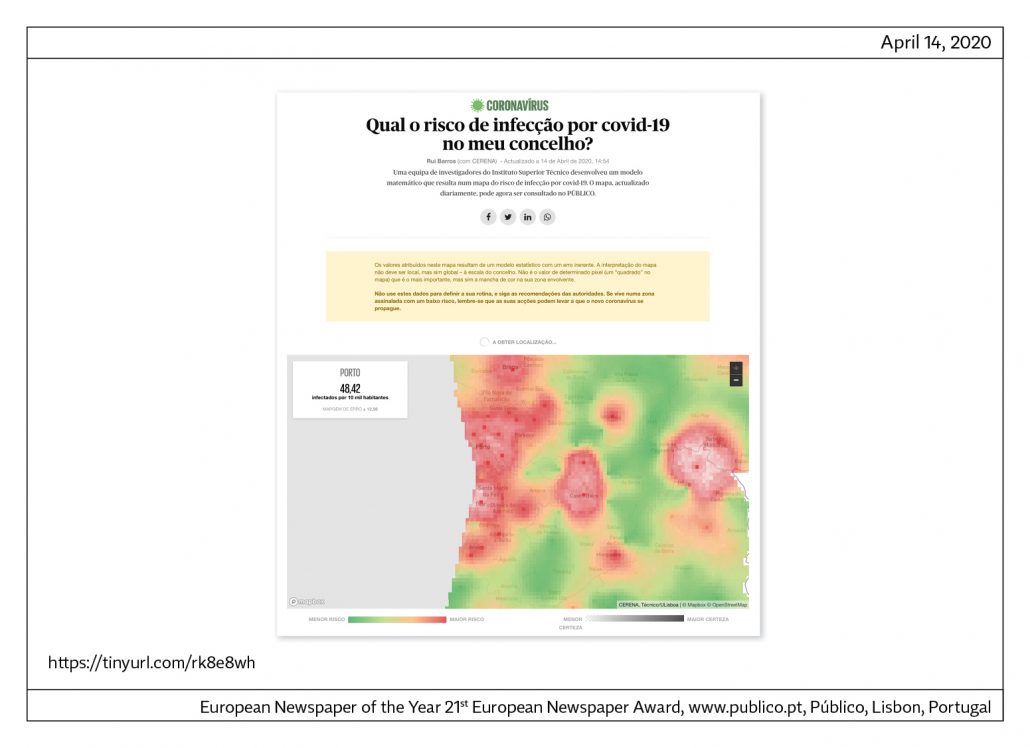
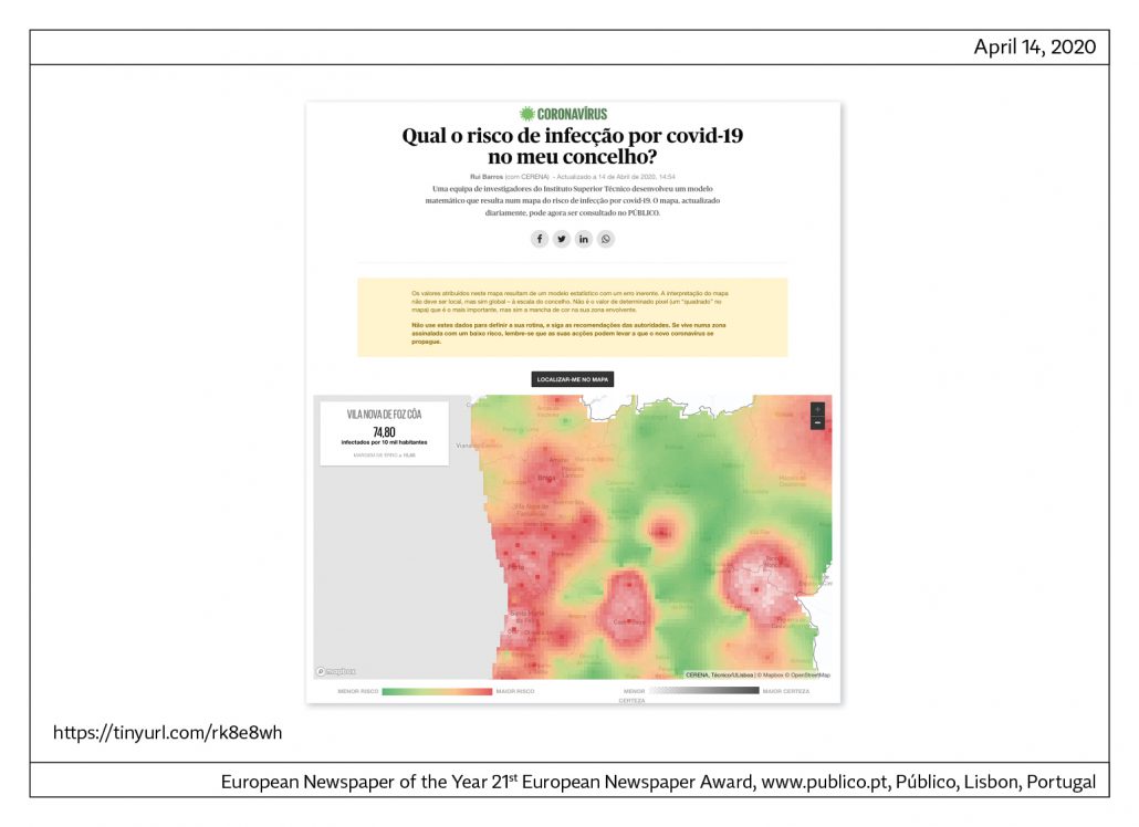

This is the LINK.
European Newspaper of the Year: FT Weekend, GB
European Newspaper of the Year,
Category weekly newspaper: Financial Times Weekend, GB
Jury statement
FT Weekend has an exemplary classically elegant design: clean, clear and with colours designed to create soft contrasts on the sepia paper on which it is printed.
The newspaper is divided into three sections that change their design from the normal everyday layout, but do not move away from the main aesthetic line of the FT. The first part is for national and international news. Part two – “House & Home” – is dedicated to real estate, architecture and garden. Part three – “Life & Arts” – deals with style, travel, books and art.
FT Weekend is part of an extraordinary success story: the newspaper has more than
a million subscribers. Digital subscriptions account for more than three quarters of the
total circulation. Because of the importance of the online product, FT has also won
several awards in the online categories of the European Newspaper Award.
About the newspaper
FT Weekend is published in Nordic format and has a circulation of around 185,000 copies. The newspaper is published in 15 countries and has more than one million subscribers. FT employs 400 journalists, one photographer and five layouters.
Front page
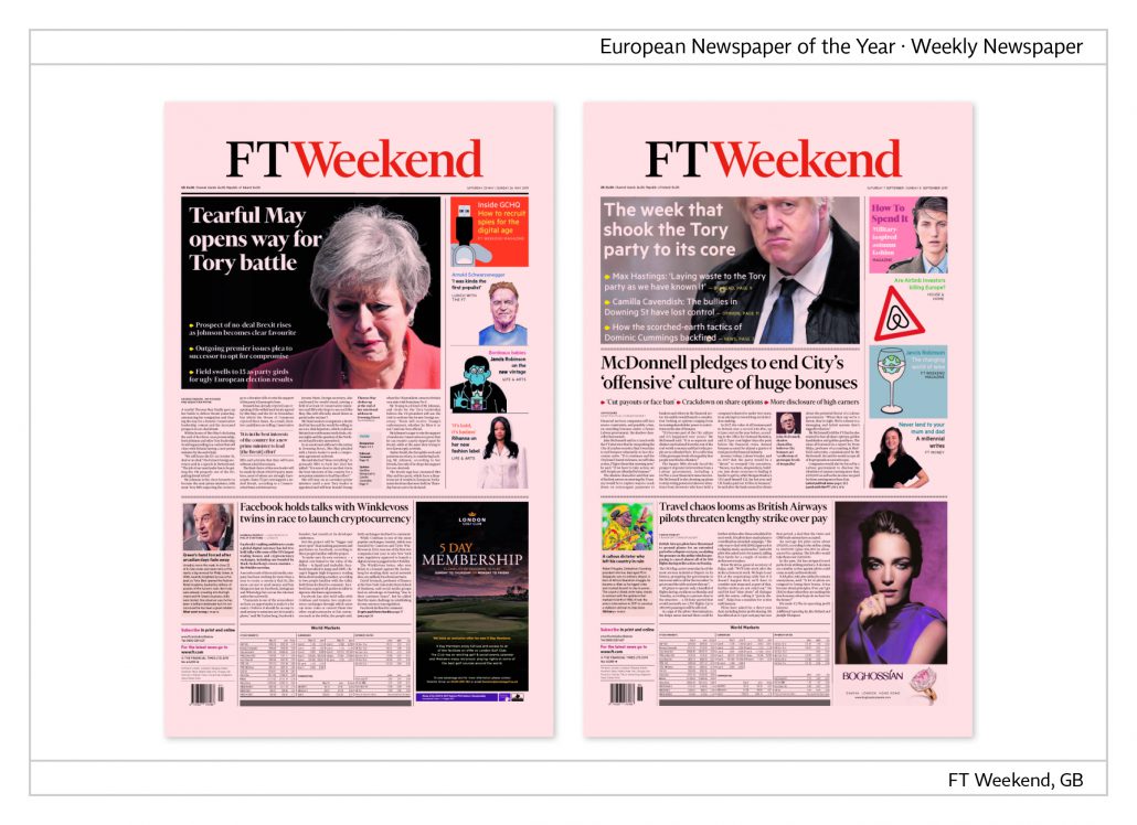
The masthead is clear and reduced and void of any additional text. A poster-like and well-cut photo is placed on the upper part of the page with the headline and lead-in inserted. The article about Theresa May ’s withdrawal appears directly below her portrait, whereas the photo of Boris Johnson is separated from another article below by a thin black line. On the right next to the photos is a column with references to topics on inside pages.
Inside pages
Inside pages have a six-column grid, broken up by variable columns which make room for captions.
Opinion page
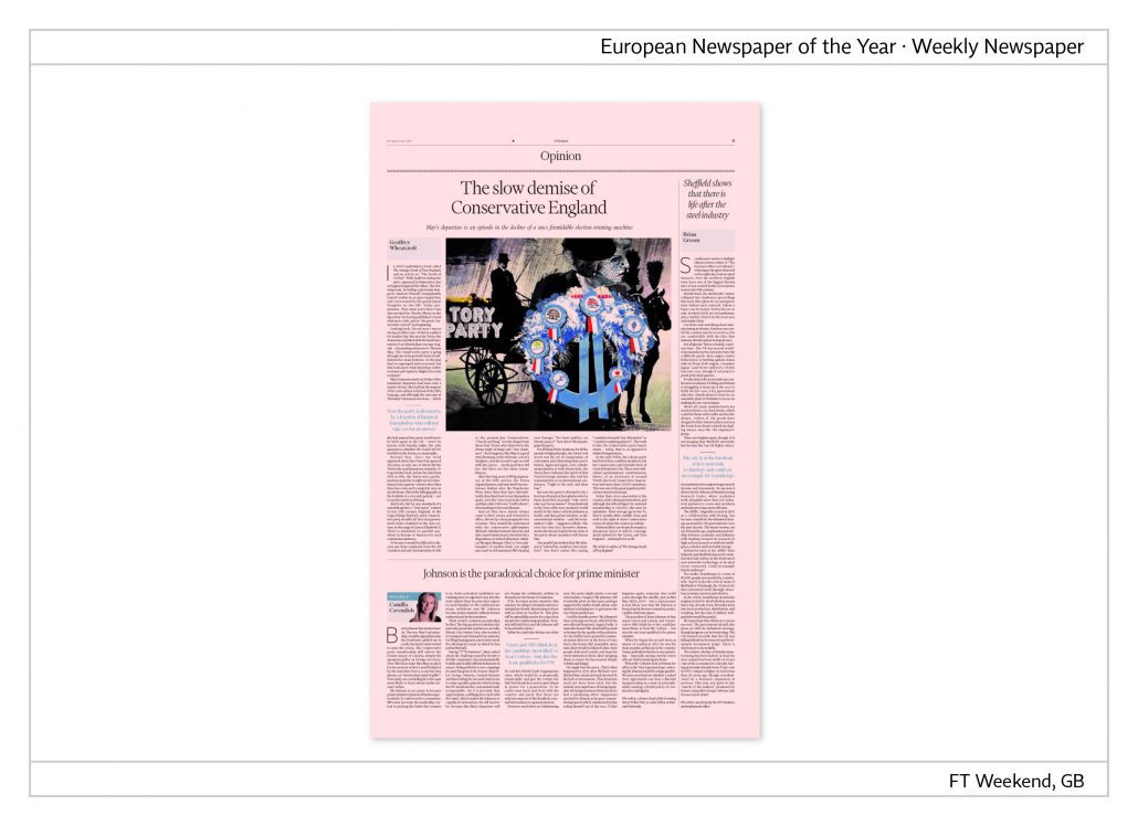
Articles on the opinion page are headed by the names of the authors, sometimes their portraits appear, too. For a more relaxed layout blue four-line paragraphs are inserted.
FT Big Read
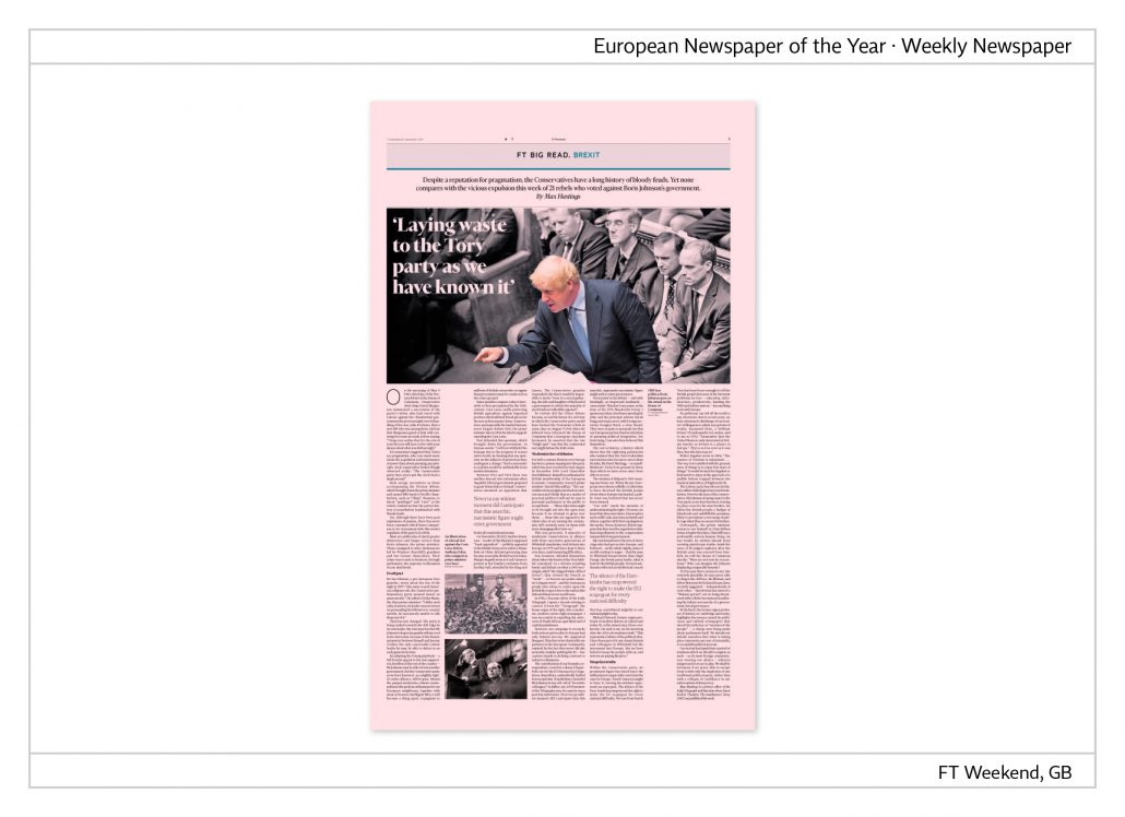
The page head indicates the topic, followed by a two-line information on the appropriate theme. The headline is inserted in the picture. In the example shown, the photo has been processed in such as way as to emphasize a colourful Boris Johnson against an otherwise black-and-white background. The page is broken up by two variable columns.
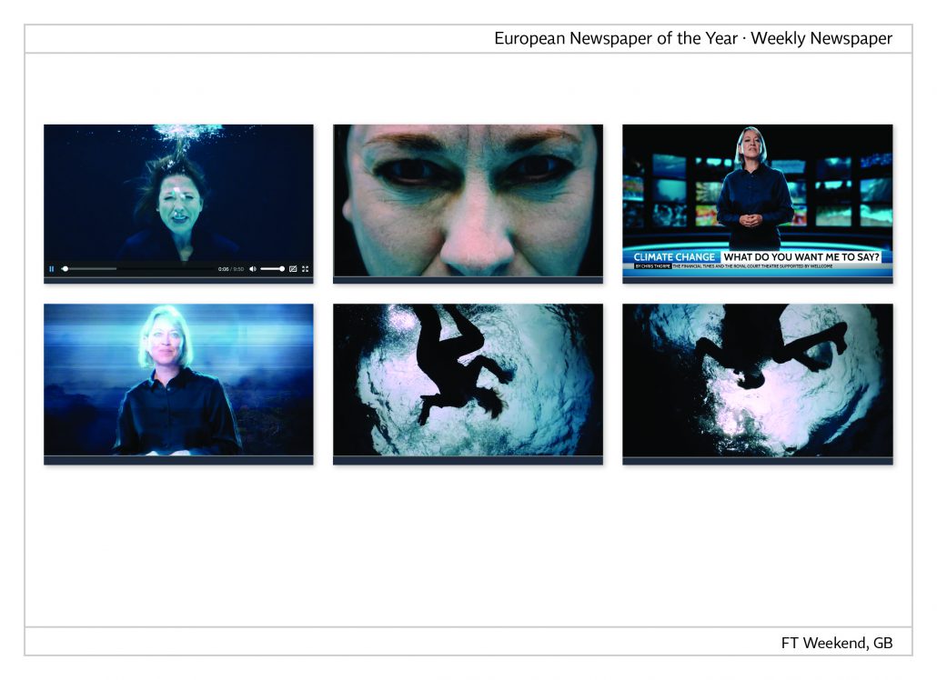
A video on the change in climate – Climate change: what do you want me to say?
The lead-in reads, “The future is here to meet us. In the run-up to the UN climate summit, FT and The Royal Court Theatre have jointly worked on a brief drama pointing out the inactivity in the area of climate change. The actress Nicola Walker, reading news from the year 2050, asks why we ‘never really learned how to talk about it.’”
Link to the video: ft.com/climatechangefilm

Interactive game
FT has invented an interactive game that can be played on the website. The reader takes on the role of a Chinese business consultant devising exporters from China on recently inflicted US customs.
This is the link: https://ig.ft.com/trump-china-tariffs/
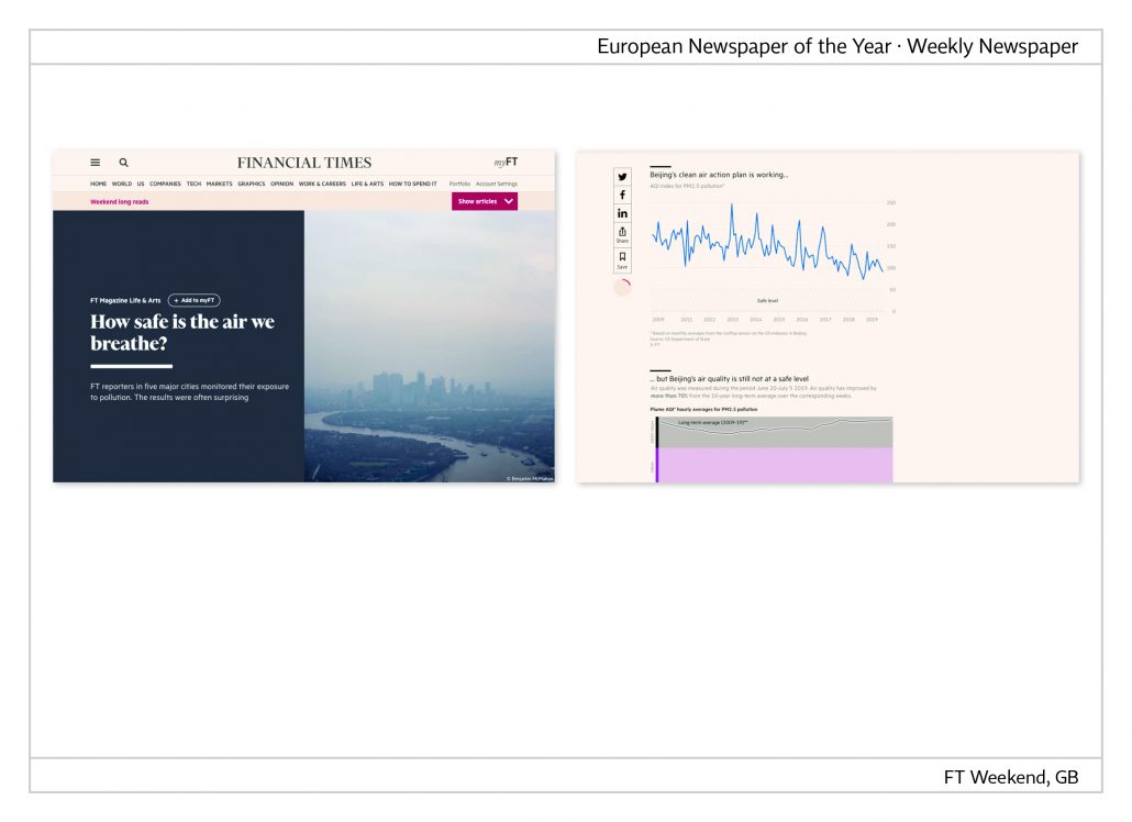
Monitoring air pollution
The introduction to this multimedia story reads, “FT asked five correspondents in Beijing, Lagos, London, New York and São Paulo to carry a personal air pollution monitor for one to two weeks and to record the results. Five different stories came out in the end revealing amazing results.”
Link: https://tinyurl.com/y3oga7tc
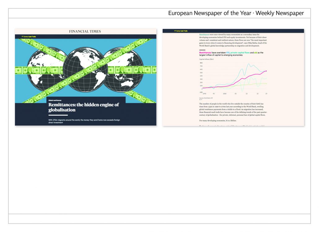
The engine of globalisation
With 270 million migrants worldwide the money that they transfer home supersedes the amount of direct foreign investments. FT analyses how money transfers flow into all parts of the world and how they affect the economy in many countries.
Link: https://tinyurl.com/y3kddq9h
FT during the Corona crisis
The following examples show data journalistic projects of the FT, which are constantly updated.
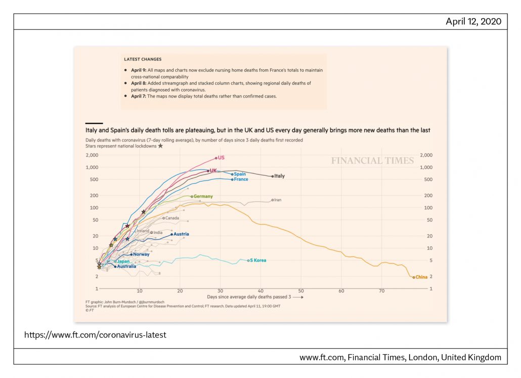
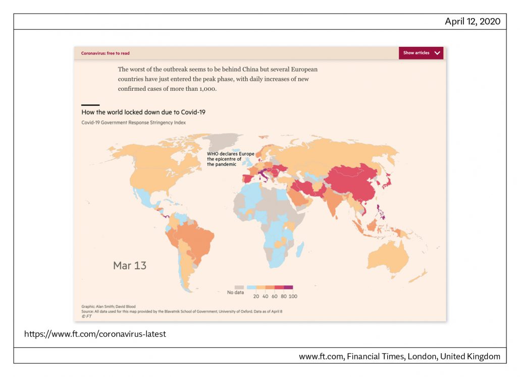
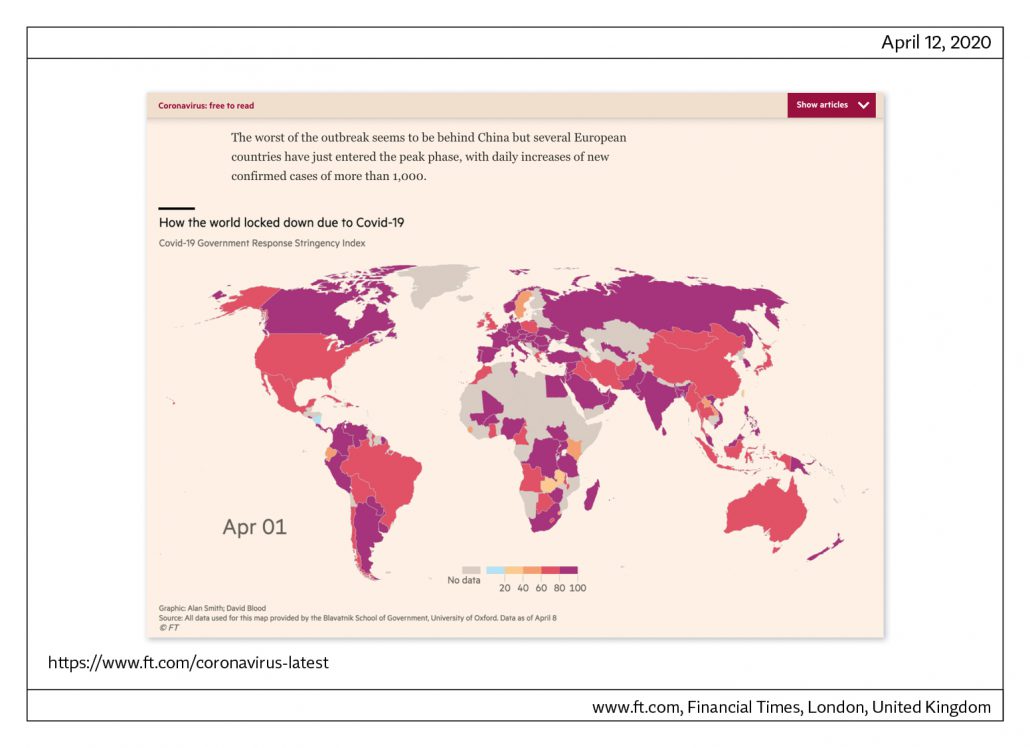


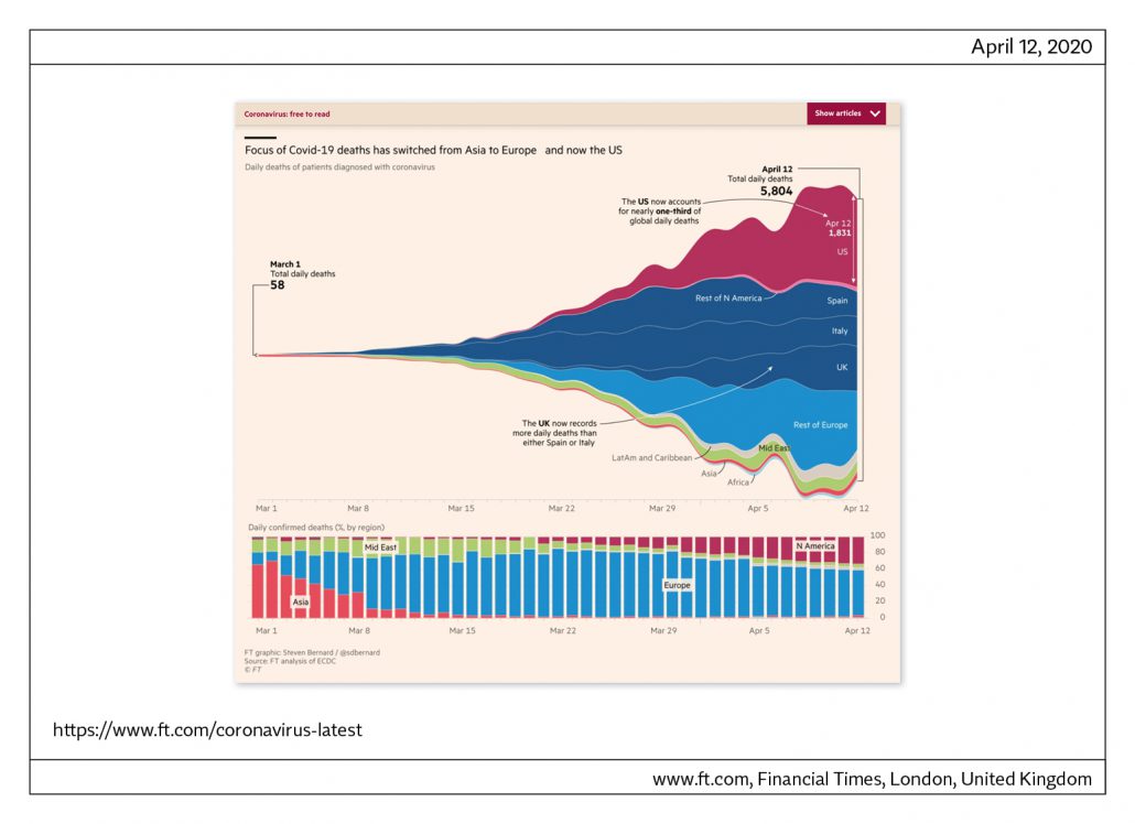
This is the LINK.
European Newspapers of the Year – winners 1999 – 2019
1. European Newspaper Award (1999)
Local newspaper: Firda, Norway
Regional newspaper: Dagblad de Limburger, The Netherlands
Nationwide newspaper: Die Welt, Germany
Weekly newspaper: no award
2. European Newspaper Award (2000)
Local newspaper: Laagendalsposten, Norway
Regional newspaper: El Correo, Spain
Nationwide newspaper: The Guardian, Great Britain
Weekly newspaper: Die Woche, Germany
3. European Newspaper Award (2001)
Local newspaper: no award
Regional newspaper: no award
Nationwide newspaper: Diário de Noticias, Spain
Nationwide newspaper: Trouw, The Netherlands
Weekly newspaper: Independent on Sunday, Great Britain
4. European Newspaper Award (2002)
Local newspaper: Tønsbergs Blad, Norway
Regional newspaper: Bergens Tidende, Norway
Nationwide newspaper: Ta Nea, Greece
Weekly newspaper: Frankfurter Allgemeine Sonntagszeitung, Germany
5. European Newspaper Award (2003)
Local newspaper: Goienkaria, Spain
Regional newspaper: Heraldo de Aragón, Spain
Nationwide newspaper: Corriere della Sera, Italy
Weekly newspaper: Sunday Tribune, Ireland
Judges‘ Special Recognition: La Voz de Galicia, Spain
6. European Newspaper Award (2004)
Local newspaper: Diario de Noticias, Spain
Regional newspaper: Het Parool, The Netherlands
Nationwide newspaper: De Morgen, Belgium
Weekly newspaper: Sentinel Sunday, Great Britain
Weekly newspaper: Bergens Tidende, Norway
7. European Newspaper Award (2005)
Local newspaper: Östersunds-Posten, Sweden
Regional newspaper: Kleine Zeitung, Austria
Nationwide newspaper: The Guardian, Great Britain
Weekly newspaper: Die Zeit, Germany
Weekly newspaper: Presso, Finland
8. European Newspaper Award (2006)
Local newspaper: Hufvudstadsbladet, Finland
Regional newspaper: Bergens Tidende, Norway
Nationwide newspaper: De Morgen, Belgium
Weekly newspaper: Expresso, Portugal
Judges‘ Special Recognition: Superdeporte, Spain
9. European Newspaper Award (2007)
Local newspaper: The Mayo News, Ireland
Regional newspaper: el Periódico de Catalunya, Spain
Nationwide newspaper: Eleftheros Tipos, Greece
Weekly newspaper: Welt am Sonntag, Germany
10. European Newspaper Award (2008)
Local newspaper: Diári de Balears, Spain
Regional newspaper: Basler Zeitung, Switzerland
Nationwide newspaper: Svenska Dagbladet, Sweden
Weekly newspaper: Athens Plus, Greece
Judges‘ Special Recognition: nrc next, The Netherlands
11. European Newspaper Award (2009)
Local newspaper: Smålandsposten, Sweden
Regional newspaper: Stuttgarter Zeitung, Germany
Nationwide newspaper: i, Portugal
Judges‘ Special Recognition: 24 sata, Croatia
12. European Newspaper Award (2010)
Local newspaper: Diário de Notícias da Madeira, Portugal
Regional newspaper: Bergens Tidende, Norway
Nationwide newspaper: Politiken, Danmark
Weekly newspaper: Sunday Herald, Scotland
Judges‘ Special Recognition: Gealscéal, Ireland
Judges‘ Special Recognition: Frankfurter Rundschau iPad, Germany
12+1. European Newspaper Award (2011)
Local newspaper: Hordaland, Norway
Regional newspaper: Berliner Morgenpost, Germany
Nationwide newspaper: Berlingske, Danmark
Weekly newspaper: NZZ am Sonntag, Switzerland
14. European Newspaper Award (2012)
Local newspaper: Bygdanytt, Norway
Regional newspaper: El Correo, Spain
Nationwide newspaper: De Tijd, Belgium
Nationwide newspaper: Trouw, The Netherlands
Weekly newspaper: Die Zeit, Germany
Judges‘ Special Recognition: Welt am Sonntag Kompakt, Germany
15. European Newspaper Award (2013)
Local newspaper: Hallingdølen, Norway
Regional newspaper: Leeuwarder Courant, the Netherlands
Nationwide newspaper: de Volkskrant, the Netherlands
Weekly newspaper: Welt am Sonntag, Germany
Judges‘ Special Recognition: Moskovskie Novosti, Russia
Judges‘ Special Recognition: público.pt, Portugal
16. European Newspaper Award (2014)
Local newspaper: The Mayo News, Ireland
Regional newspaper: De Twentsche Courant Tubantia, the Netherlands
Nationwide newspaper: Público, Portugal
Weekly newspaper: Sonntagszeitung, Switzerland
17. European Newspaper Award (2015)
Local newspaper: Kvinnheringen, Norway
Regional newspaper: Ara, Spain
Nationwide newspaper: De Morgen, Belgium
Weekly newspaper: Expresso, Portugal
Judges‘ Special Recognition: publico.pt, Portugal
Judges‘ Special Recognition: Souriatna, Syria
18. European Newspaper Award (2016)
Local newspaper: Hufvudstadsbladet, Finland
Regional newspaper: Het Parool, the Netherlands
Nationwide newspaper: Politiken, Denmark
Weekly newspaper: Frankfurter Allgemeine Sonntagszeitung, Germany
19. European Newspaper Award (2017)
Local newspaper: Tageblatt, Luxemburg
Regional newspaper: De Limburger, the Netherlands
Nationwide newspaper: Handelsblatt, Germany
Weekly newspaper: Morgenbladet, Norway
20. European Newspaper Award (2018)
Local newspaper: Sunnhordland, Norway
Regional newspaper: Adresseavisen, Norway
Nationwide newspaper: Het Financieele Dagblad, The Netherlands
Weekly newspaper: der Freitag, Germany
21. European Newspaper Award (2019)
Local newspaper: Fædrelandsvennen, Norway
Regional newspaper: Leeuwarder Courant, the Netherlands
Nationwide newspaper: Público, Portugal
Weekly newspaper: Financial Times – FT Weekend
