Here we present some of the winners of the Data Journalism category of the 26th European Newspaper Award.
Hier stellen wir einige Preisträger der Kategorie Daten-Journalismus des 26. European Newspaper Award vor.
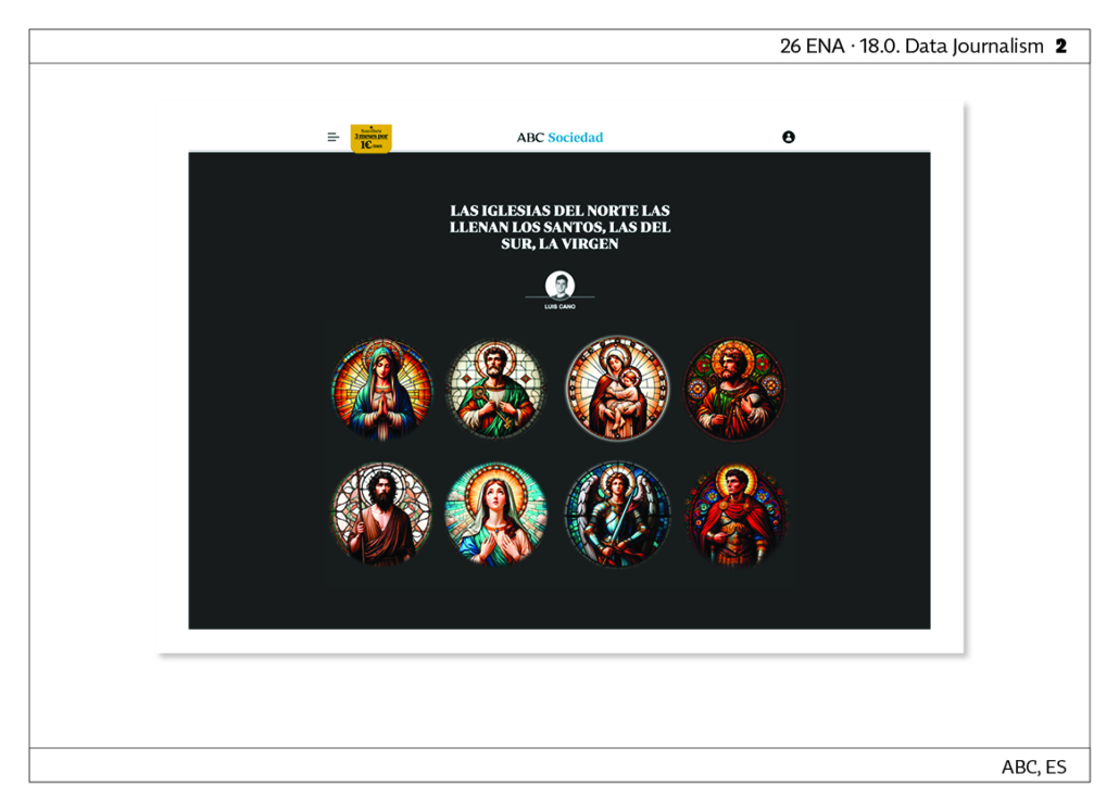
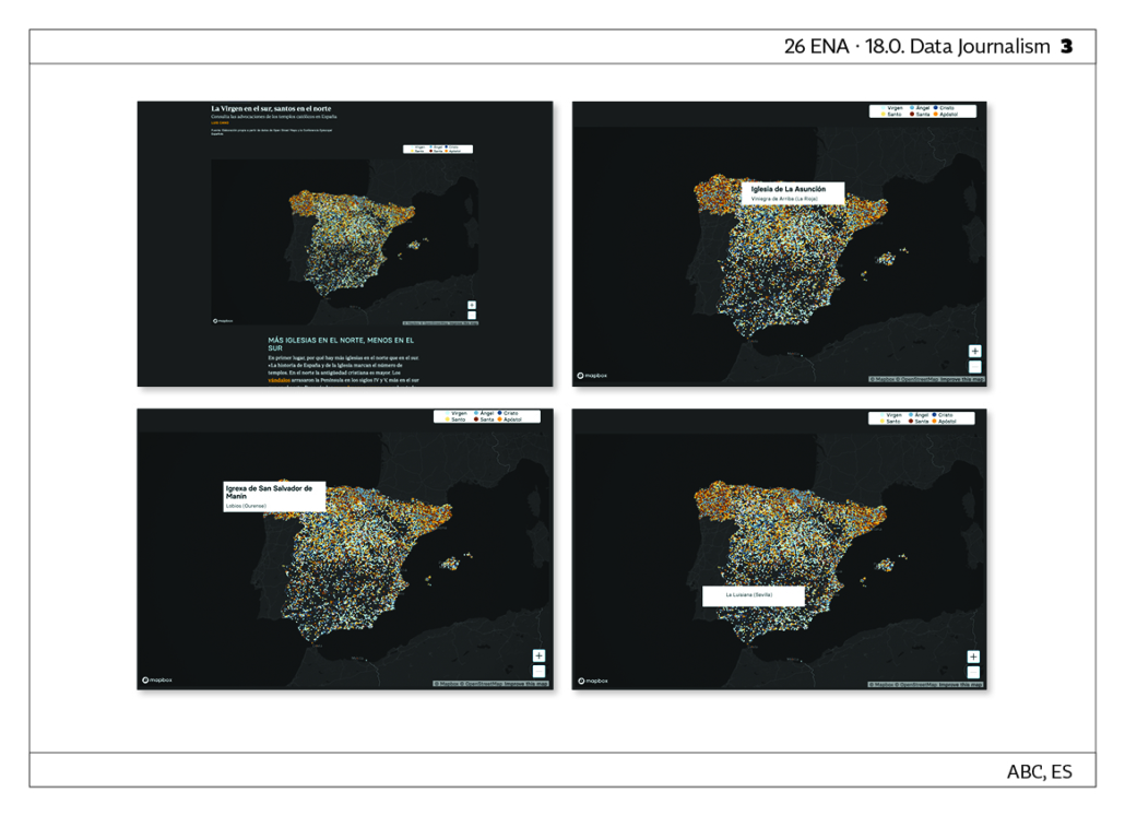
The churches of the North are filled with saints, those of the South, with the Virgin Mary. A long-form article about who the churches and chapels in Spain are dedicated to (Saints, Virgins, Apostles…), which visually communicates information from the database of the Spanish Episcopal Conference using Open Street Map technology. The images of the saints and virgins have been generated using DALL·E Artificial Intelligence. LINK
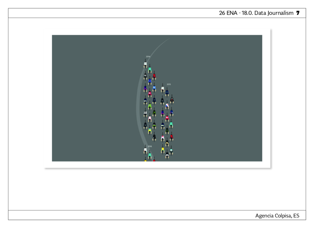
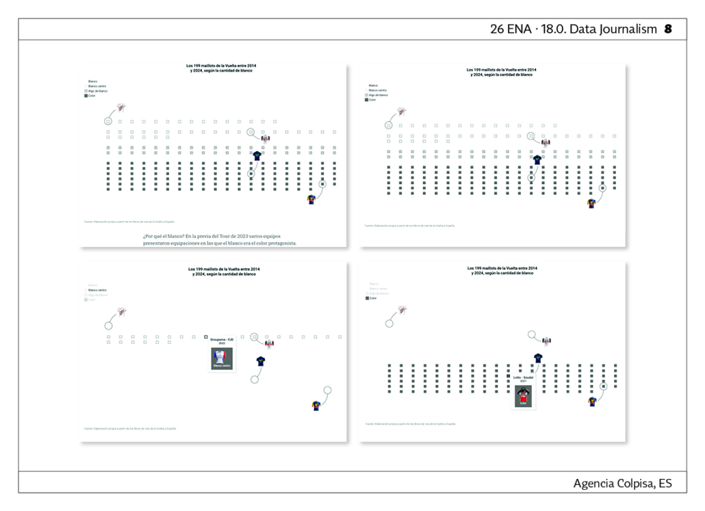
All the Maillots of the Vuelta Since 2014: How the Multicolored Peloton Has Changed. In the lead-up to the 2023 Tour, several teams unveiled kits where white was the dominant color. At the time, some articles noted that the use of white had increased in the peloton. This data journalism article is based on a dataset created from the Vuelta a Espaÿa Route Books of the past 10 years. Each maillot was analyzed and categorized based on the amount of white in its design (considering the front section`. Colpisa Agency‘s reports are published in the regional newspapers of the Vocento group. LINK
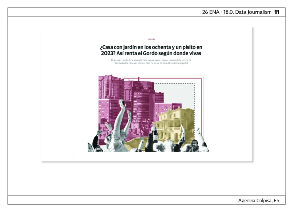
A House with a Garden in the Eighties or a Small Apartment in 2023? How the Christmas Lottery Prize Pays Off Depending on Where You Live. This project originated from an idea by Diario Sur and was developed in collaboration with Colpisa Agency. Every Christmas, there is a lottery draw in Spain. The aim was to determine whether the prize (400,000 euros) holds the same value now as it did years ago. The dataset includes historical data on the first prize (1965-2023) manually collected from collector tickets and adjusted for inflation, as well as housing prices since 1995, supplemented with earlier data from a 1996 study. Colpisa Agency‘s reports are published in the regional newspapers of the Vocento group. LINK

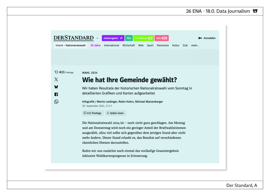
How did my community vote? We have analysed the results of the Austrian national elections in detailed graphics and maps. LINK

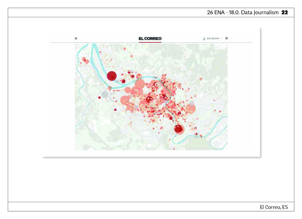
Where are the tourist apartments in Bilbao? Lower-income neighborhoods feel the most pressure. Bilbao has 1,324 declared tourist apartments or rooms, with capacity for 5,284 people. In neighborhoods like ‘Casco Viejo’, if they were all occupied, it would mean 30% of its population. An analysis of massive data crossed with other demographic data shows us how particular neighbourhoods in the city of Bilbao suffer more than others the pressure of accommodation for tourists and visitors. LINK

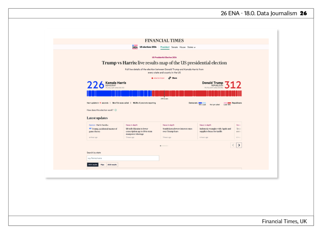
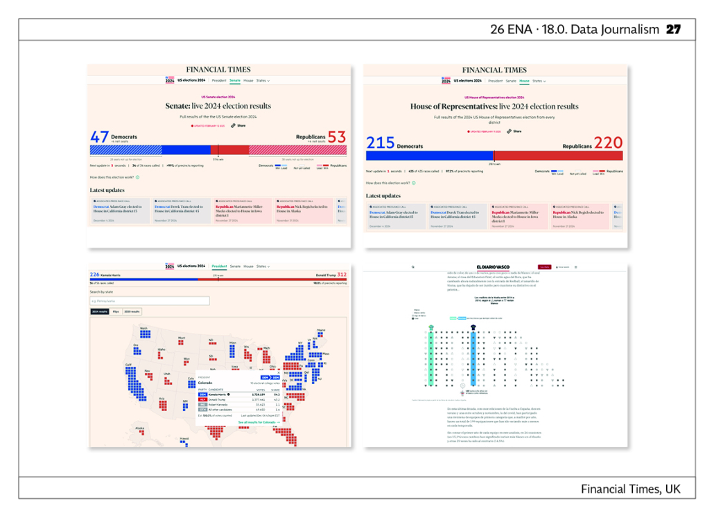
Trump vs Harris: live results map of the US presidential election. LINK
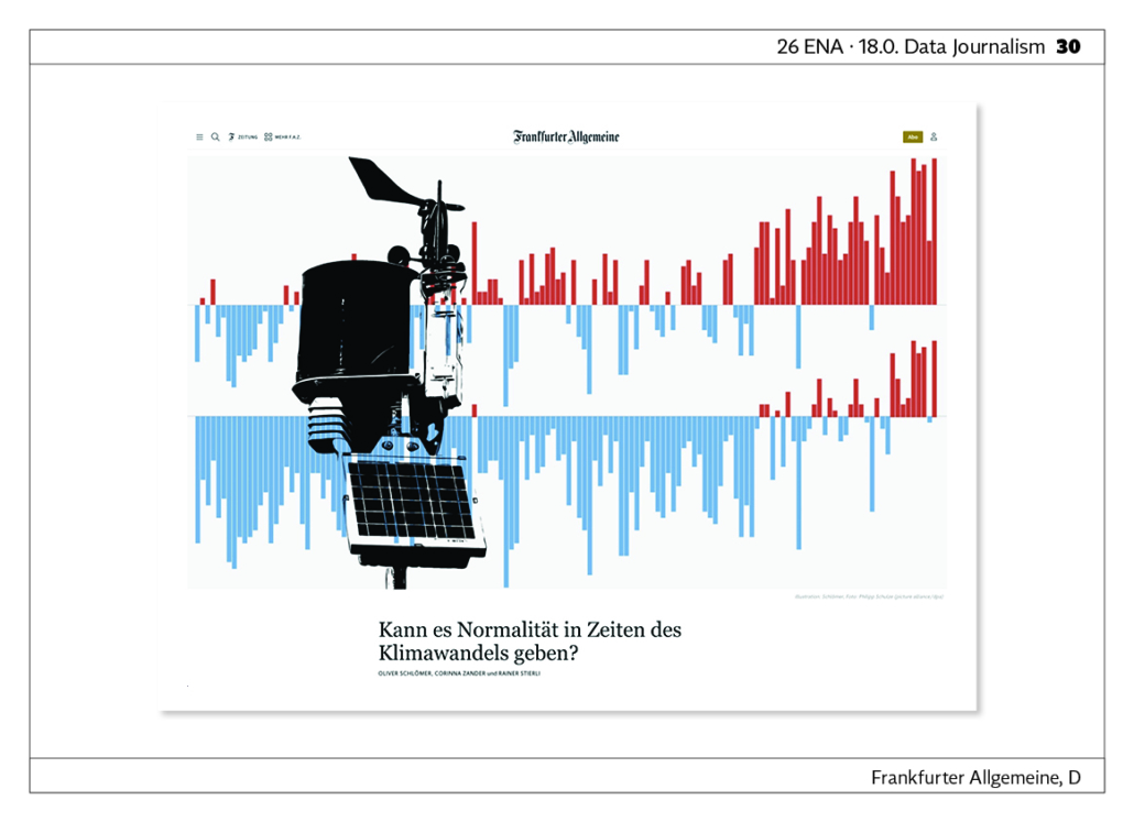
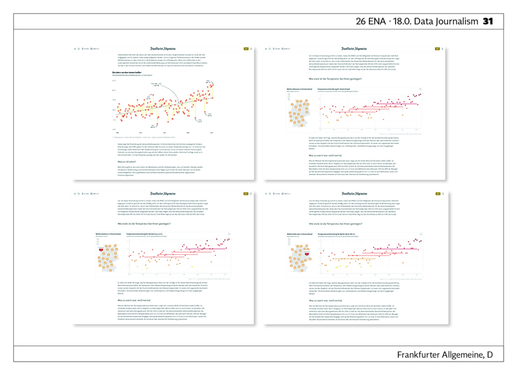
Can there be normality in times of climate change? The data-based storytelling deals with long-term weather data and its interpretation in relation to climate change. How we measure climate change is a question of statistics. What historical reference periods are relevant when compared to current weather data to capture the dynamics of change? What is an appropriate average resulting from this? The storytelling illustrates these questions through various data visualisations. For example, an interactive visualisation shows data from 144 weather stations across Germany, looking at local temperature trends in annual averages and 30-year averages. This gives the reader a comprehensive impression of the long-term development of the climate. LINK
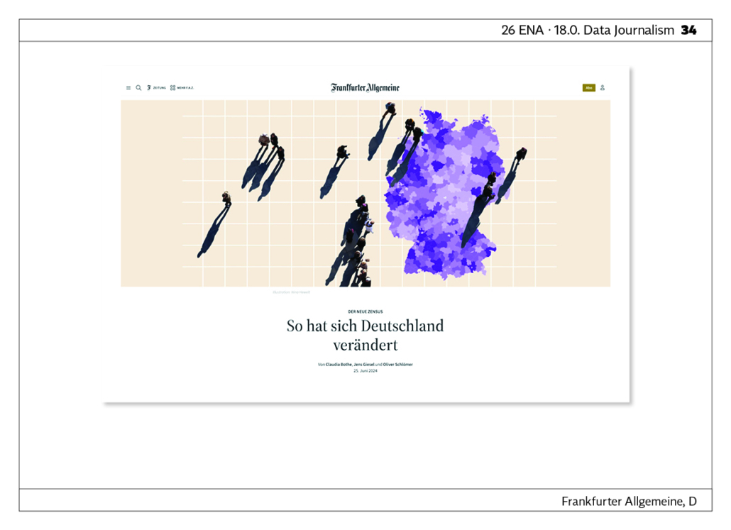
Census: “That‘s how Germany has changed”. How did Germany change between 2011 and 2022? By analyzing the recently released 2022 census data and comparing it with the previous census from 2011, we aimed to provide a comprehensible yet engaging deep dive into Germany’s population, diversity, and housing situation. Our goal was to highlight the most interesting aspects and present them in a highly detailed manner. To achieve this, we created maps at both the regional level and in 1 km grid cells, allowing readers to look up data for their specific hometownor community. In sum, the article aims to break down a complex dataset in an informative, engaging, and visually appealing way. LINK

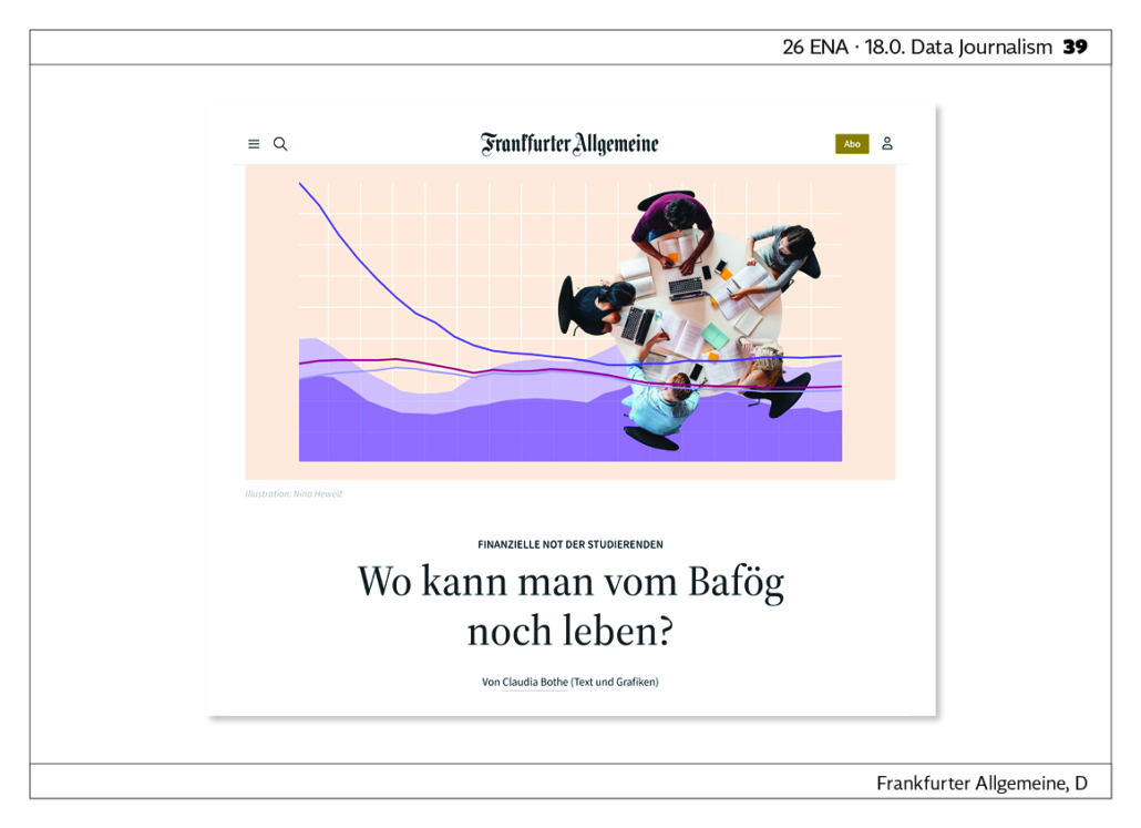
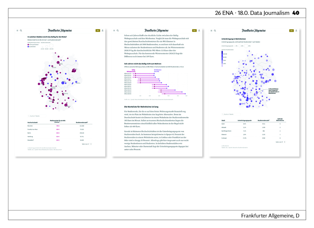
Where can you still live on Bafög? In which German cities can students still aford to pay their rent? Just in time for the start of the new semester, the German government has raised the monthly allowance of the state education funding program (BAföG). However, this analysis shows that in most German university cities, the allowance is barely enough to cover the rent. By displaying the data on a map, readers can quickly get an overview of where the average rent for a shared flat falls within the state allowance and where students without additional funds are likely unable to pay the rent. Meanwhile, corresponding tables allow readers to engage with the data more deeply by searching for specific cities. LINK
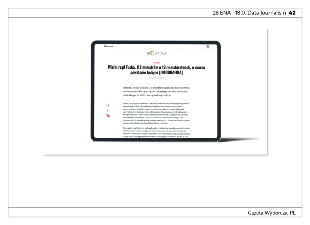
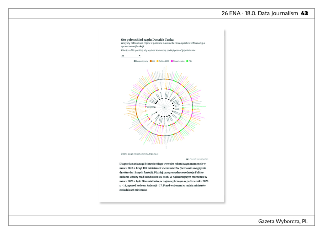
The Grand Government of Tusk. 112 ministers in 19 ministries, in March a further. Before the Civic Coalition government takes power in Poland, we show the composition of the new government, the number of groups forming subsequent Polish governments and the size of the cabinets. LINK
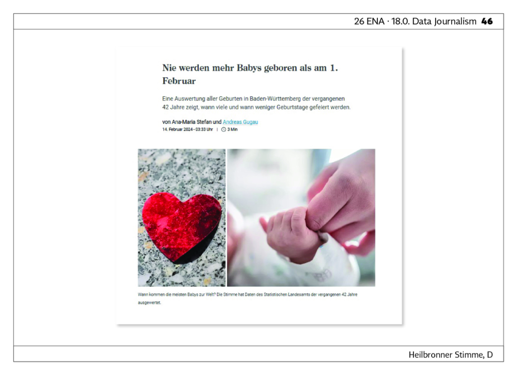
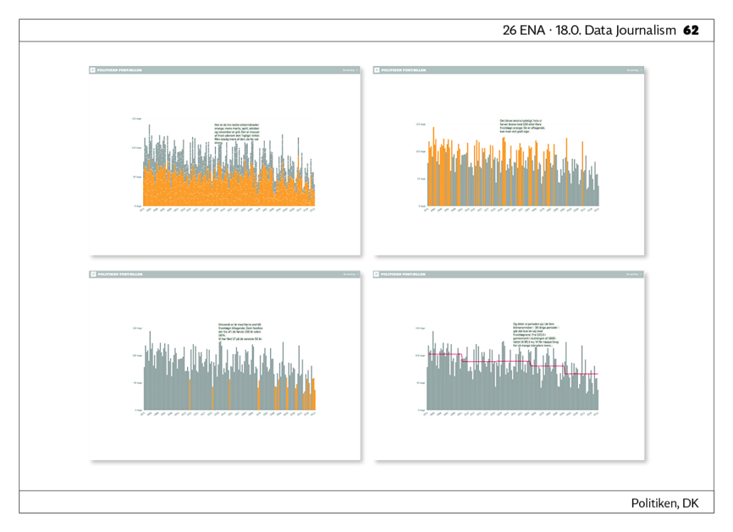
There are never more babies born than on 1 February. An analysis of all births in Baden-Württemberg over the past 42 years shows when there are more and when there are fewer. LINK

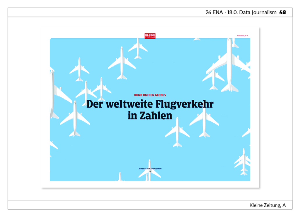
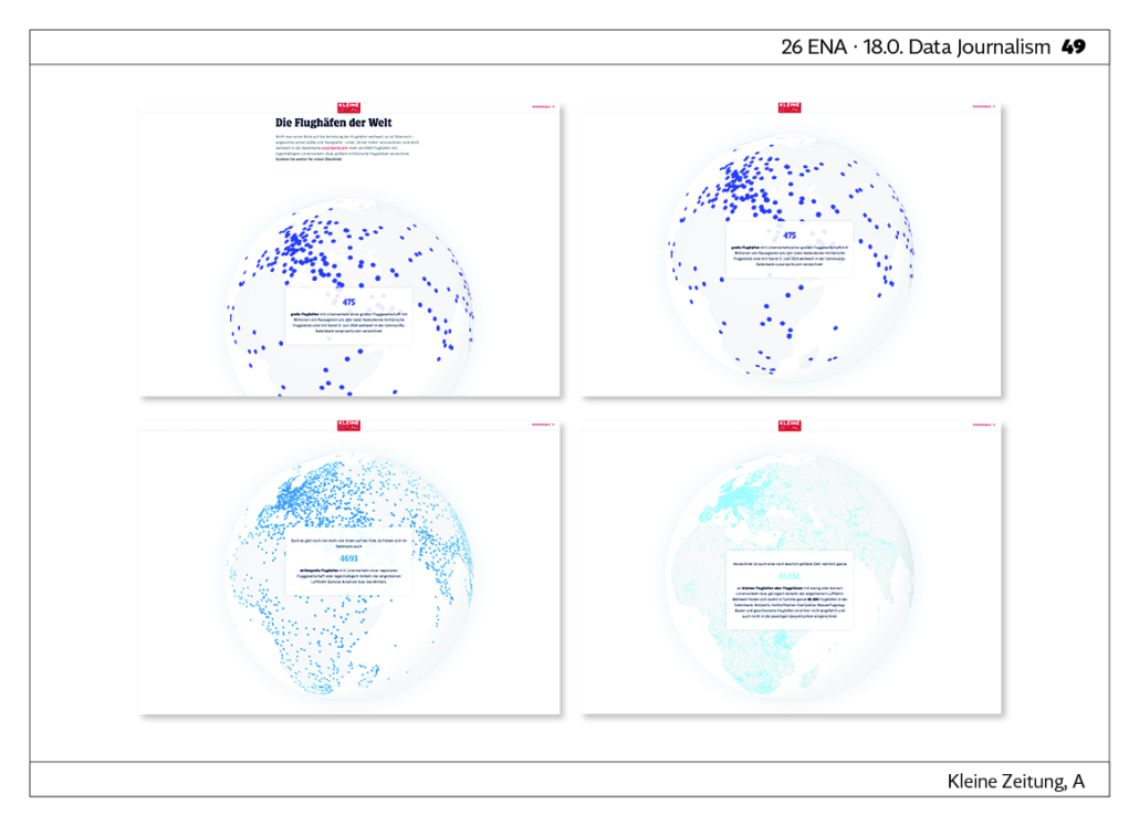
Air traffic in numbers. With nearly 96 million flights and 8.7 billion passengers, global aviation in 2023 has almost returned to pre-Covid levels. A graphic overview of the more than 46,000 airports and airfields on our planet, their unique features, and the most popular flight routes. LINK
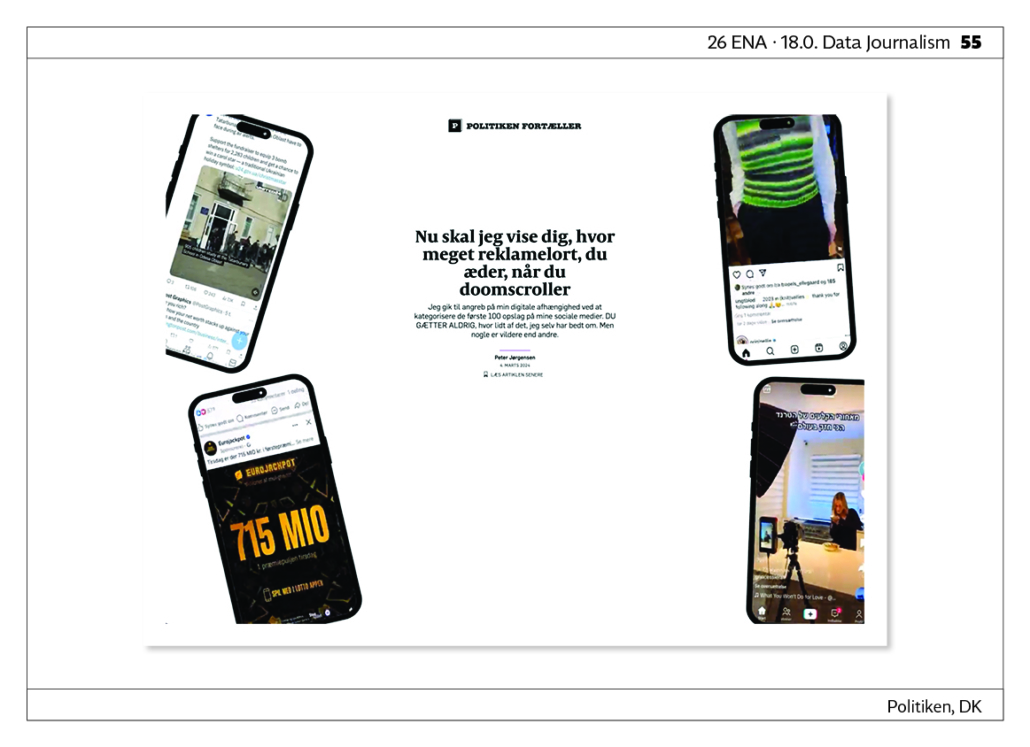
Advertising Crap Doomscroll. Now I‘m going to show you how much advertising crap you consume when you doomscroll. I tackled my digital addiction by categorizing the first 100 posts on my social media. You‘ll never guess how little of it I actually asked for. But some are crazier than others.< LINK

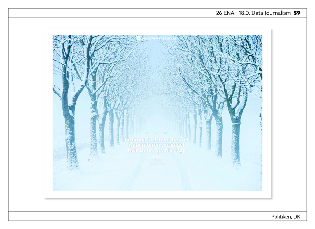
Winter in Numbers – March is the new December When was the last time you got snowed in? Exactly … Even though we‘ve had quite a bit of snow this winter, it‘s not really a thing. But it used to be. Our winters were harsher, colder, the seas around us froze, and the snow was so high that we couldn‘t even open our door. … says Grandpa. But how right is he really? LINK
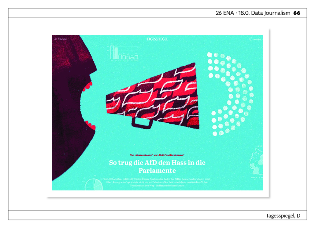
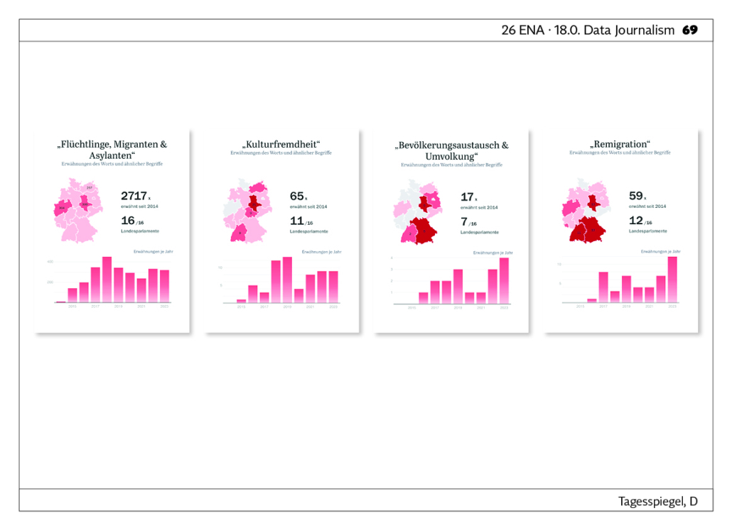
Of ‘knifemen’ and ‘fucki-fucki bikers’ – How the AfD brought hatred into the parliaments. 340,000 paragraphs, 15,831,486 words. Tagesspiegel Innovation Lab analysis of all AfD speeches in German state parliaments shows: It doesn‘t just talk about ‘remigration’ at secret meetings. The AfD has been paving the way for xenophobia for ten years – in the heart of democracy. The Correctiv publications about the secret meeting in Potsdam have revealed the extent of their hatred of migrants and minorities. Millions were shocked, many of whom took to the streets. However, the party‘s positions are not surprising, nor are they new. If you look at what AfD members of state parliaments have been saying publicly for years, it becomes clear that ‘remigration’ is just the tip of the iceberg. LINK
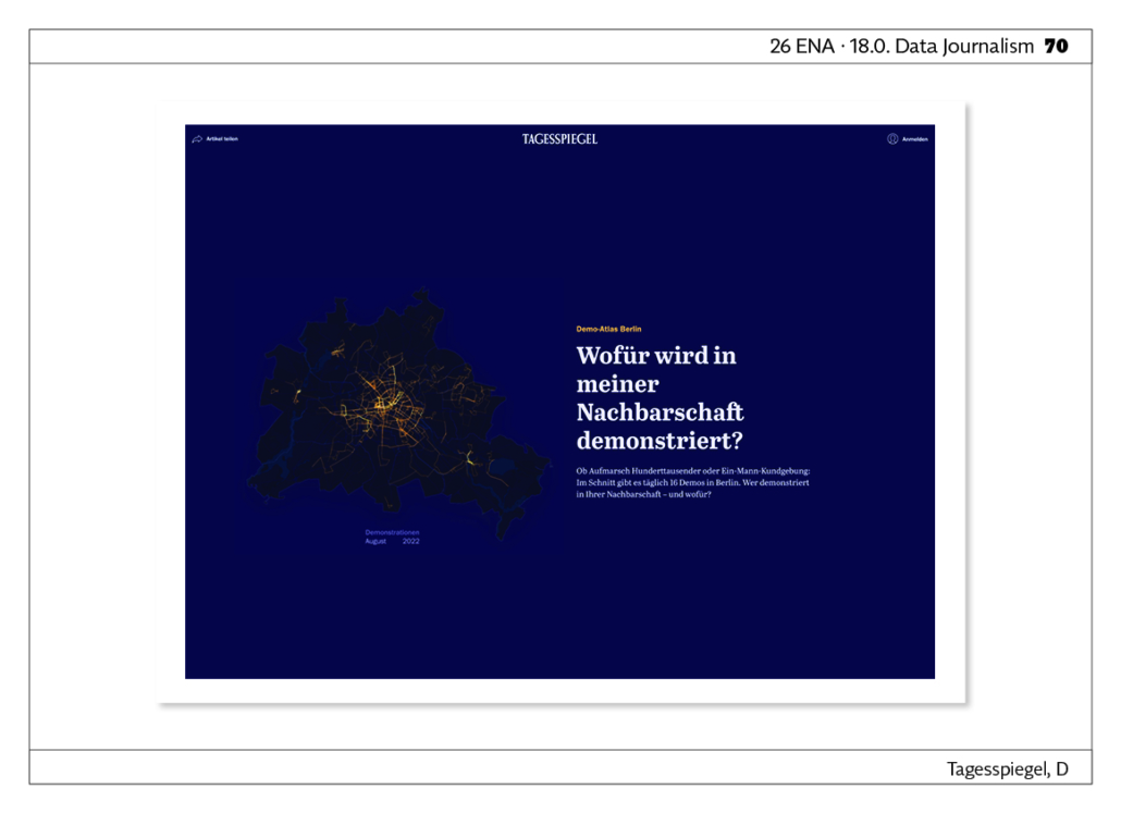
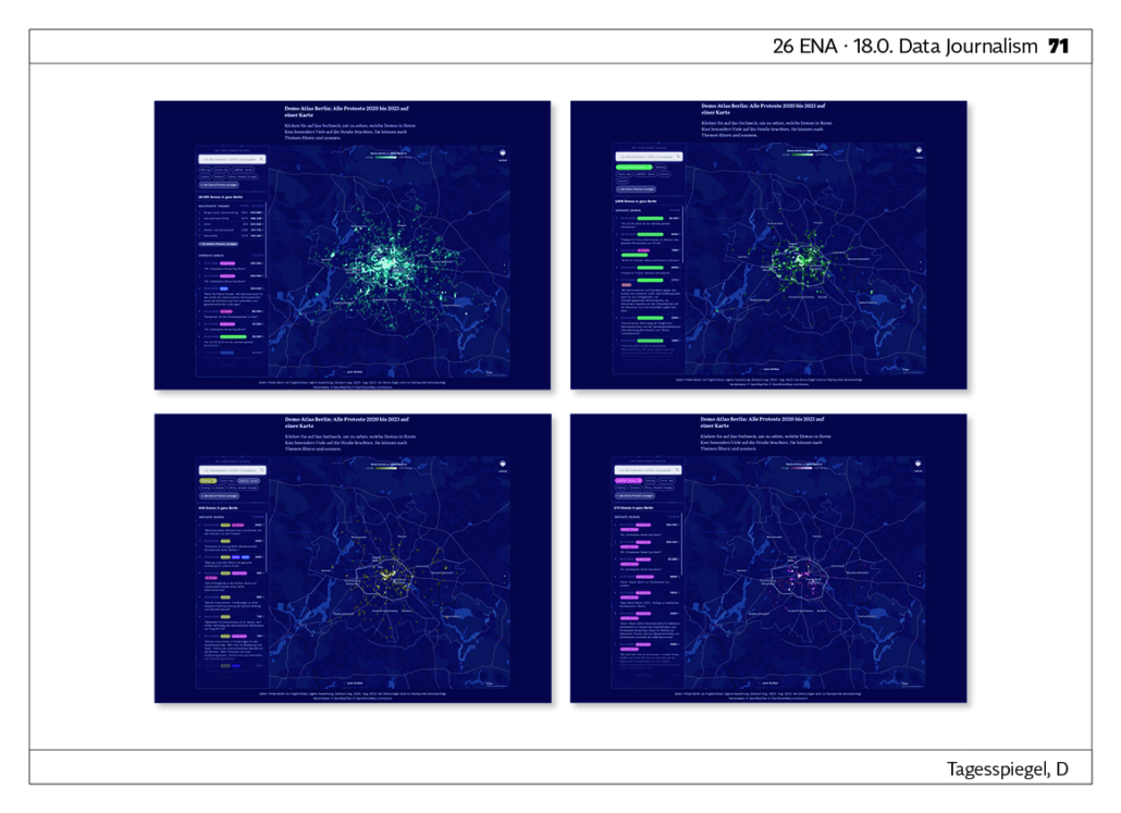
Demo Atlas Berlin: All protests from 2020 to 2023 on one map What is there a demonstration for in my neighbourhood? Whether it‘s a march of hundreds of thousands or a one-man rally: on average, there are 16 demonstrations a day in Berlin. Who is demonstrating in your neighbourhood – and what for? Anger, sadness, horror, frustration – there are many reasons to demonstrate. Even in Berlin. There were 33,083 demonstrations and gatherings between January 2018 and the end of August 2023. LINK
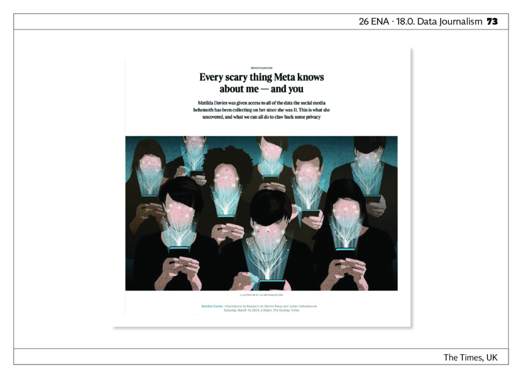
Every scary thing Meta knows about me – and you. Our journalist was given access to all of the data the social media behemoth has been collecting on her since she was 11. This is what she uncovered, and what we can all do to claw back some privacy. LINK

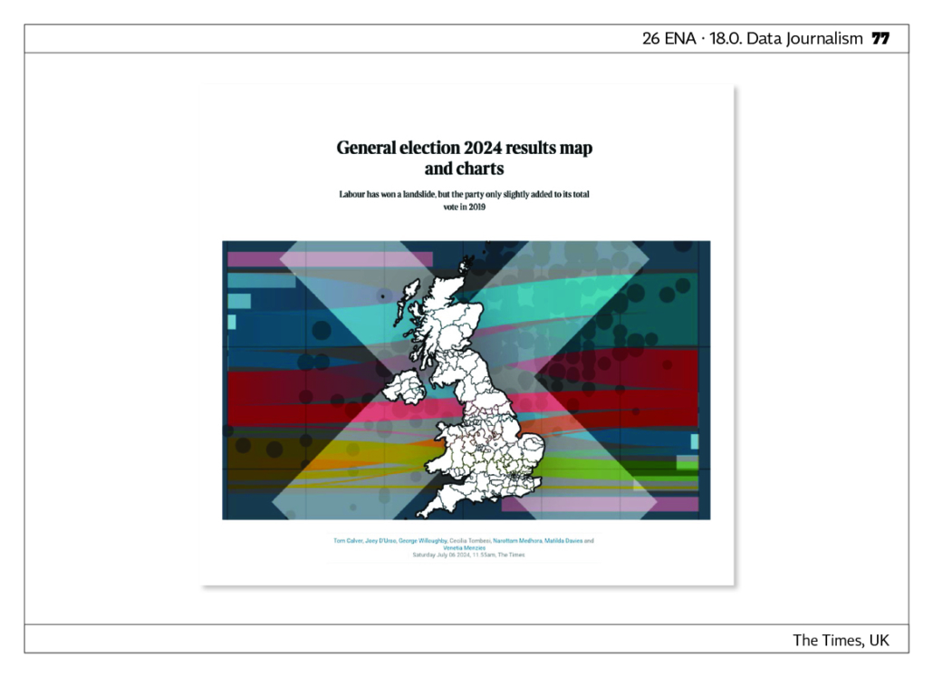
General election 2024 results map and charts. Deep dive analysis on UK election data with interactive maps and charts. Labour party has won a landslide yet the data paints a complex picture evidencing of tactical voting at play. LINK
